Last year the National Weather Service started posting experimental probabilistic storm total snowfall graphics. These graphics are a way of communicating the uncertainties inherent in predicting future snowfall and they fall out of a suite of model solutions numbering in excess of 50 (in addition to ensemble solutions).
In addition to the deterministic forecast of snowfall (what we think will "mostly likely" occur), we also provide the lower and upper bound snowfall amounts the suite of model guidance suggests is possible.
You could say these are the probabilistic "goal posts" of the forecast. If the range between the upper, lower and most likely snowfall is narrow, then you can infer there is higher confidence in the forecast. If the range is high, then confidence would be lower.
Click here: For Our Probabilistic Snowfall Experiment Graphics
Here's a .pdf document with more details about it
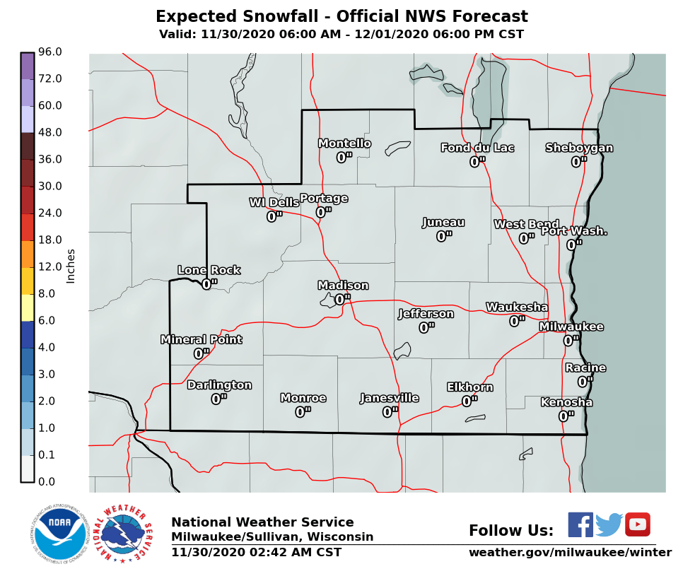
Okay, so let's look at the snowfall forecast for Friday night into Saturday. We could see a few inches of accumulation.
Here is the mostly likely snowfall accumulation by noon on Saturday:
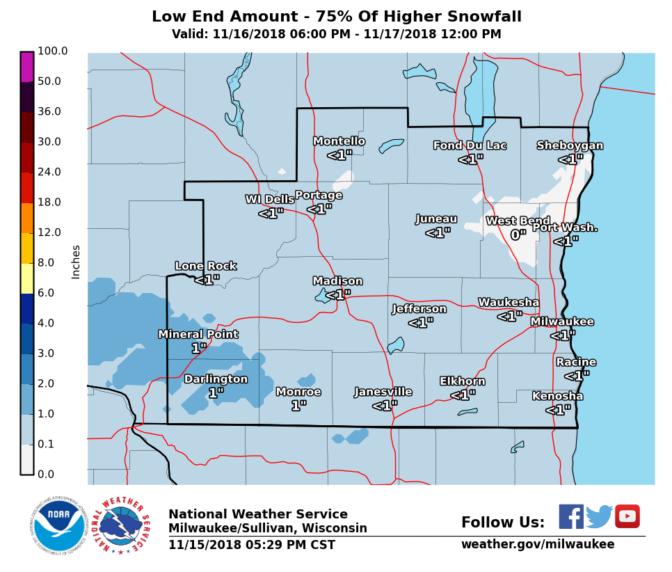
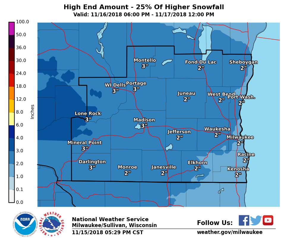
Next we'll look at the 25th and 75th percentile snowfall forecast, or the low end and high end, respectively.
(Our official Probabilistic Snowfall Experiment uses the 10th and 90th percentile rankings)
Here is the 25th percentile, or the lower end of the suite of model solutions. This says that 75 percent of the models generated more than this amount, and 25 percent generated even less.
Here is the 75th percentile, or the higher end of the suite of model solutions. This says that 75 percent of the models generated less than this amount, and 25 percent generated even more!
If this statistical analysis to predicting the future isn't your thing, just stick with our deterministic, or mostly likely forecast. But, if you want to try to understand the uncertainty and possibilities in that forecast, look at the probabilistic forecasts.
Davis