Example of How to Interpret a Climate Prediction Center Graphic
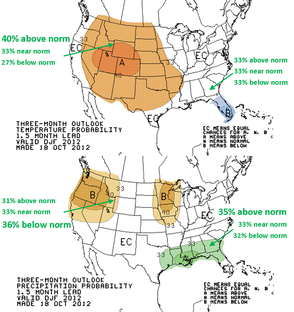
Several example locations (noted by the arrows) are included in the above maps with corresponding percent chances for above, near, and below normal conditions.
The top map indicates the 3-month temperature probability. One can interpret the first temperature probability graphic as much of the western half of the country having a greater than 33% chance for above normal temperatures this winter, while only the Florida peninsula has a greater than 33% chance for below normal temperatures. The other areas in white labeled with “EC” have an equal chance for experiencing above, below, or near normal temperatures.
The bottom map shows the 3-month precipitation probability. As far as precipitation likelihood, one can see that the northern Gulf coast has a greater chance to have above normal amounts, while the upper Midwest and Pacific Northwest have greater chances for below normal.


 Follow us on YouTube