NOAA Releases Updated Climate Normals
Posted: 8 AM MST Tuesday May 4, 2021
Click here to access data files for the 1991-2020 Climate Normals from NCEI.
Note: All images below are linked to higher resolution version.
Today the NOAA National Center for Environmental Information (NCEI) released updated climate normals, reflecting observed data for the 1991-2020 period. These updates occur every ten years, in accordance with established practices by the World Meteorological Organization, and reflect the most recent three decade period. Climate normals provide a benchmark to compare daily weather to and are broadly utilized by industry, media, and researchers.
|
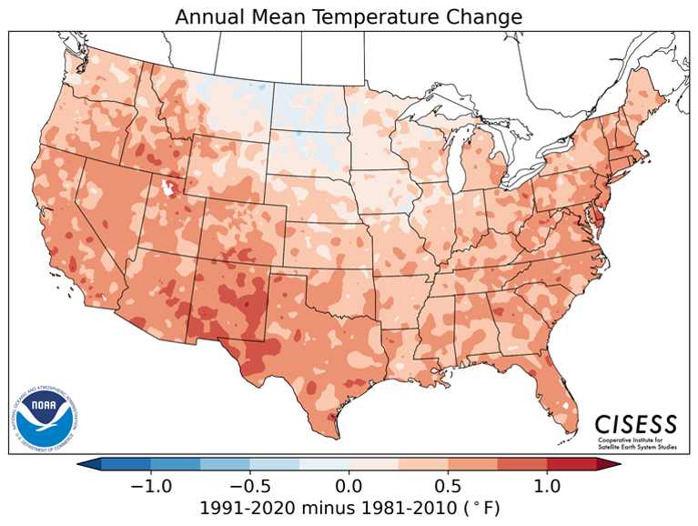
Change (in degrees Fahrenheit) for annual mean temperature from 1981-2010 to 1991-2020. |
Chance (in inches) for annual precipitation |
What is normal?
In the strictest sense, a "normal" of a particular variable (e.g., temperature) is defined as the 30-year average. For example, the average temperature normal in January for Phoenix would be computed by taking the average of the 30 January values of monthly averaged temperatures from 1991 to 2020. Each of the 30 monthly values was in turn derived from the daily average temperature for the station.
In practice, however, much more goes into NCEI's Climate Normals product than simple 30-year averages. Procedures are put in place to deal with missing and suspect data values in a process to homogenize neighboring stations to produce a coherent and consistent data set. In producing the newest set of Climate Normals, the years of 1981-1990 were replaced with the years 2011-2020 before passing through NCEI data quality checks. Individual stations can then be gridded into a mean monthly map.
Climate normals are produced for a number of meteorological variables including temperatures, precipitation, heating and cooling degree days, growing season length, etc. Most normals for primary meteorological measures are now available for the 1991-2020 period, however some more specialized normals will be released at a later date.
Notable changes from 1981-2010 to 1991-2020
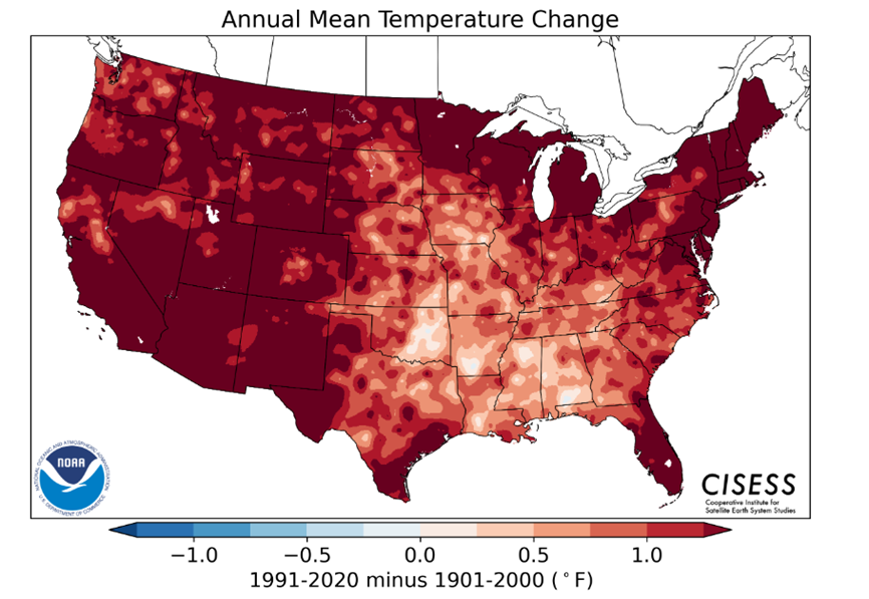
With the exception of the northern Plains, the annual mean temperature increased across the country. The Southwest experienced the most pronounced warming with the decadal increase generally between 0.5°F and 1.0°F. This decadal increase is consistent with both observational data over the past 40 years in addition to long term climate models incorporating human influences.
|
Changes in annual normals for select locations within the NWS Phoenix forecast area. |
||||||
|
|
Phoenix, AZ |
Yuma, AZ |
Scottsdale, AZ |
Phoenix/ Deer Valley Airport, AZ |
Imperial, CA |
Blythe, CA |
|
1991-2020 Average Annual Temperature (°F) |
75.6 |
76.0 |
73.3 |
72.6 |
73.7 |
74.4 |
|
1981-2010 Average Annual Temperature (°F) |
75.0 |
75.8 |
72.5 |
72.0 |
73.0 |
73.6 |
|
Difference |
+0.6 |
+0.2 |
+0.8 |
+0.6 |
+0.7 |
+0.8 |
|
1991-2020 Average Annual Rainfall (in) |
7.22 |
3.28 |
8.73 |
8.90 |
2.38 |
3.56 |
|
1981-2010 Average Annual Rainfall (in) |
8.03 |
3.56 |
10.27 |
10.76 |
3.44 |
3.83 |
|
Difference |
-0.81 |
-0.28 |
-1.54 |
-1.86 |
-1.06 |
-0.27 |
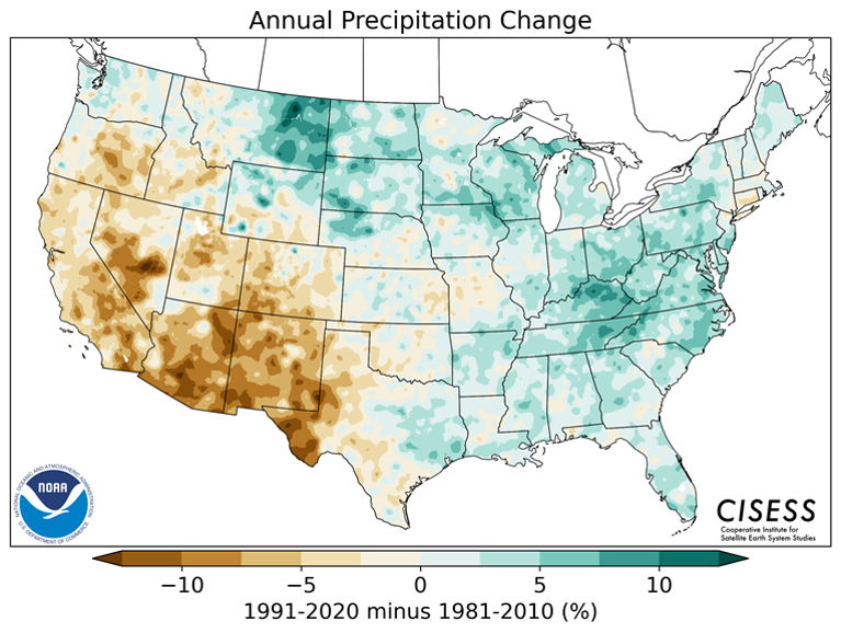
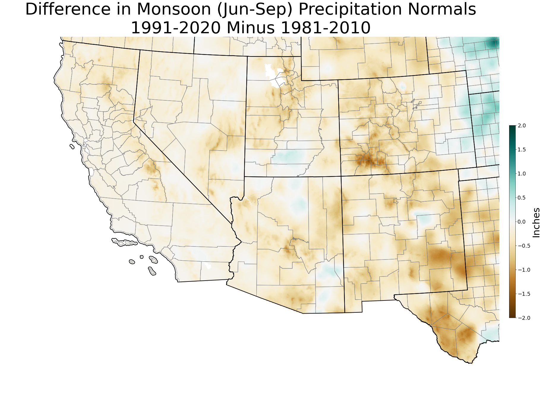
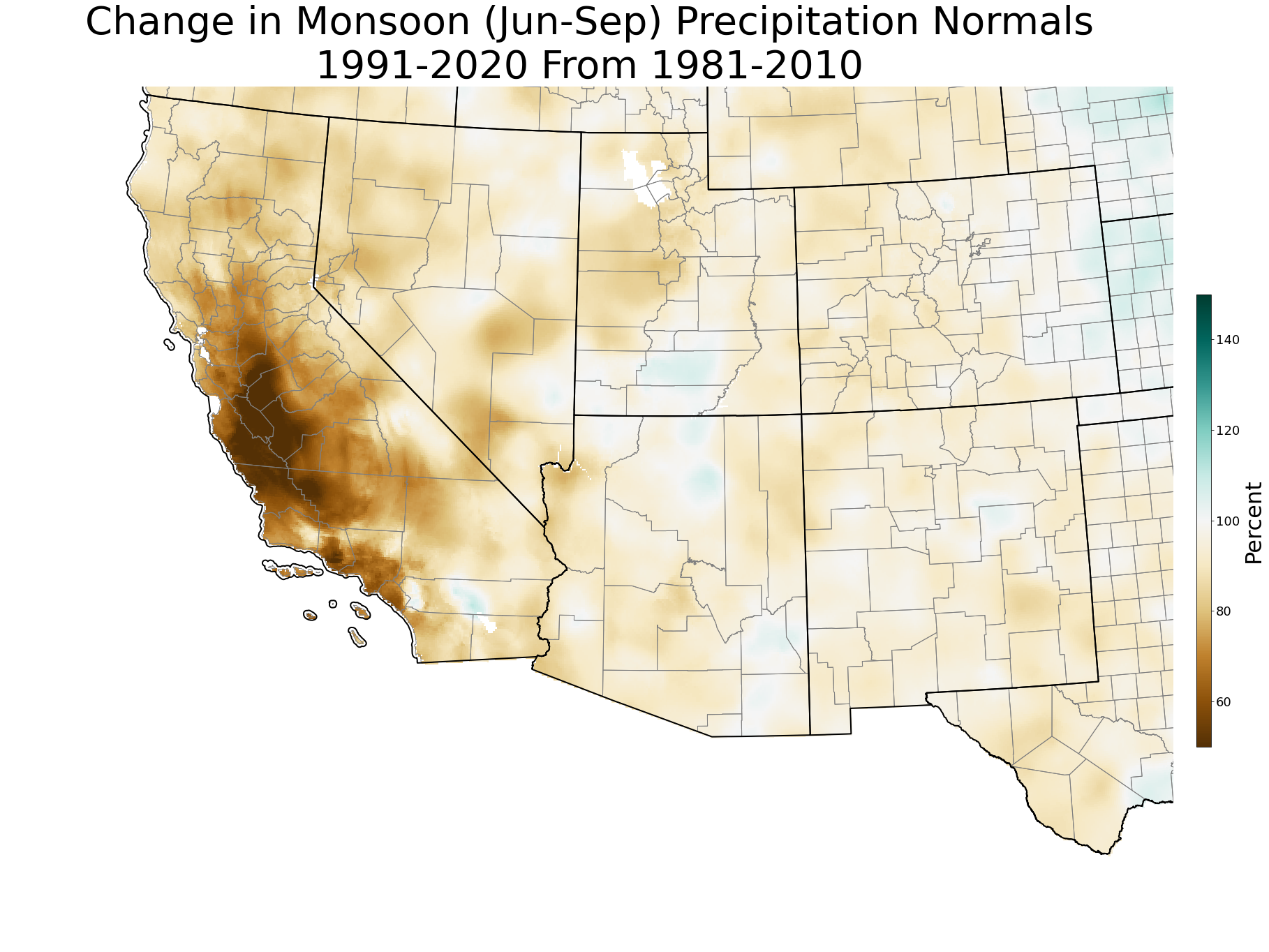
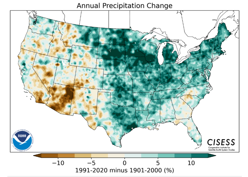
Changes in precipitation normals are somewhat more varied, but in general a wetter climate has developed over the northern and eastern United States while a drier climate is being observed in the western parts of the country. Similar to temperature normals, the Southwest has experienced some of the greatest changes with the decadal shift more than 10% drier in many locations. However, it's not clear among climate models whether this is a more permanent shift or trend in precipitation amounts, or just a temporary decadal signal (as seen in historical data - see reasons behind data changes section below).
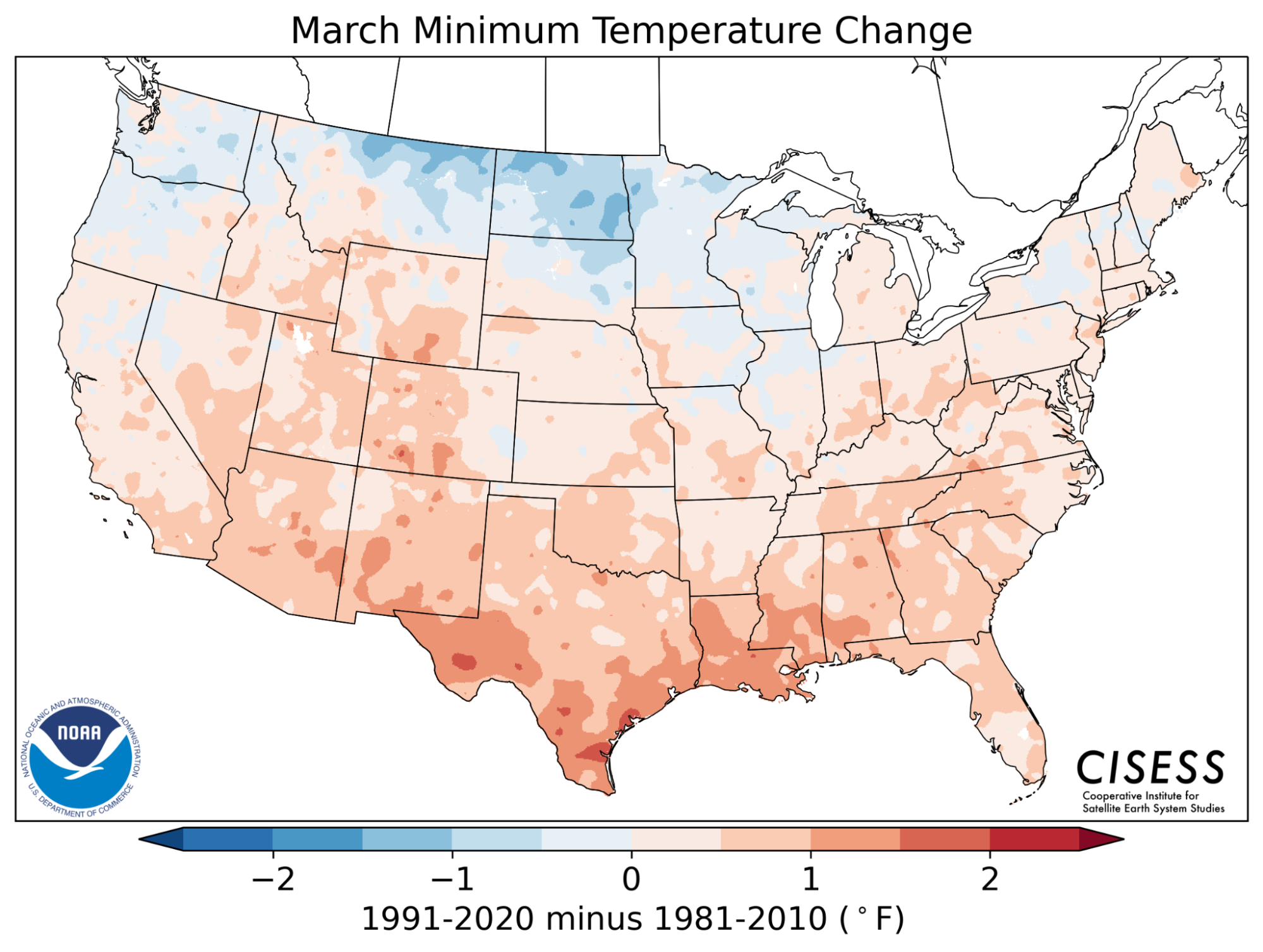
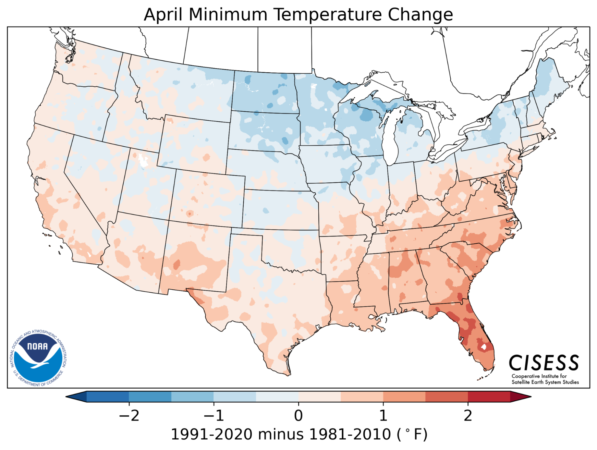
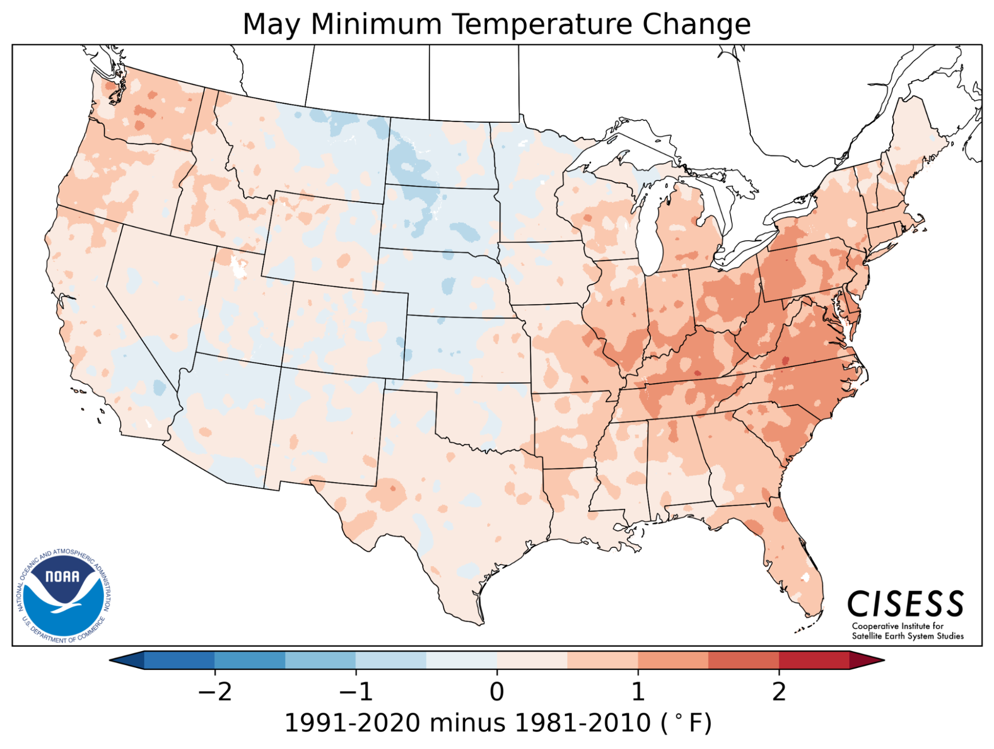
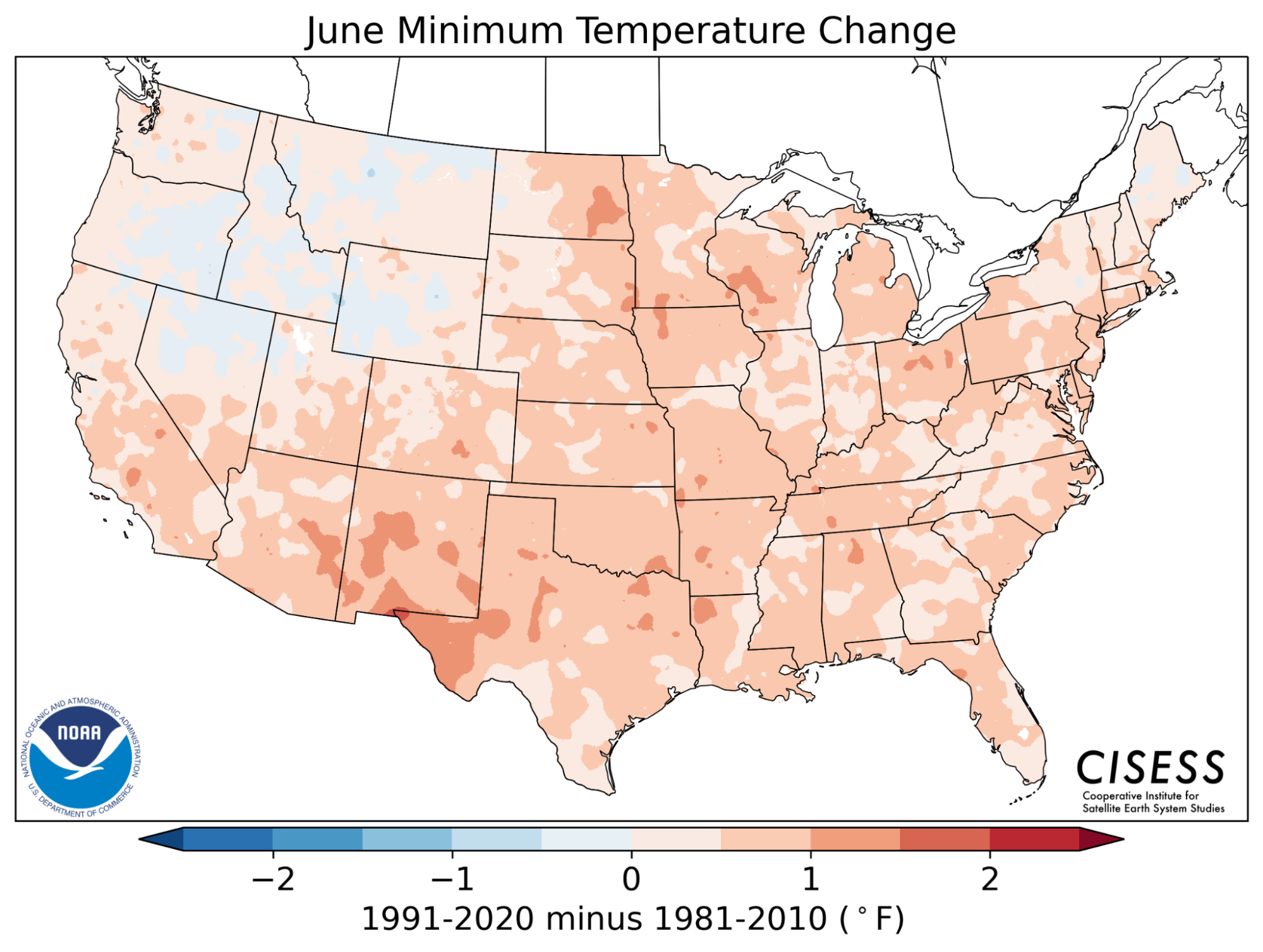
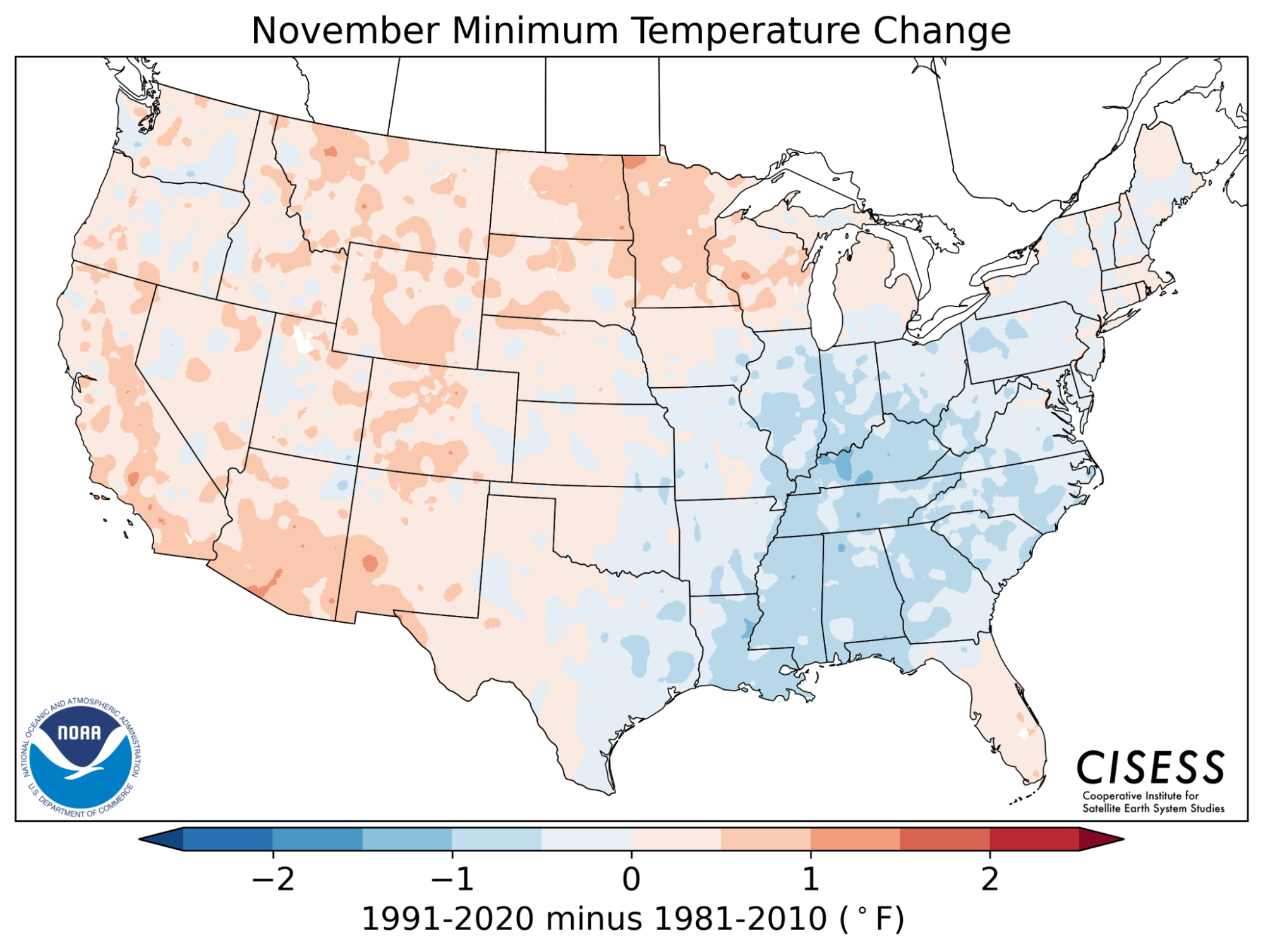
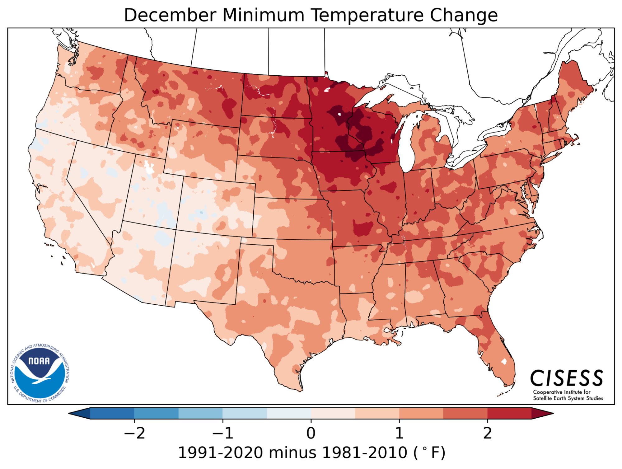
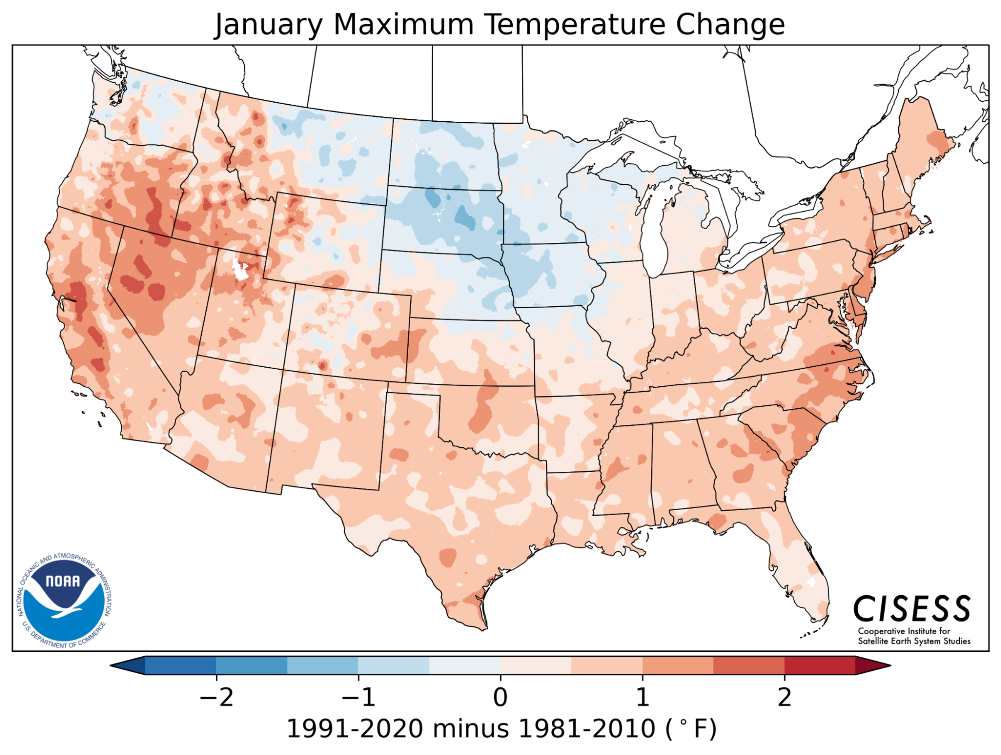
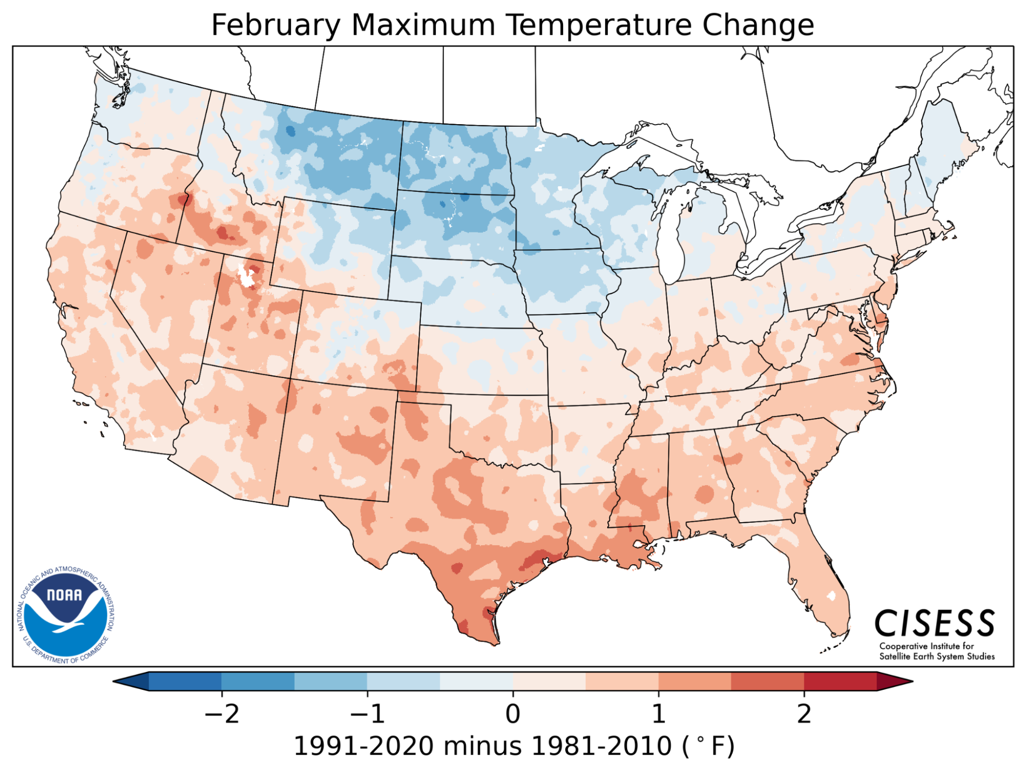
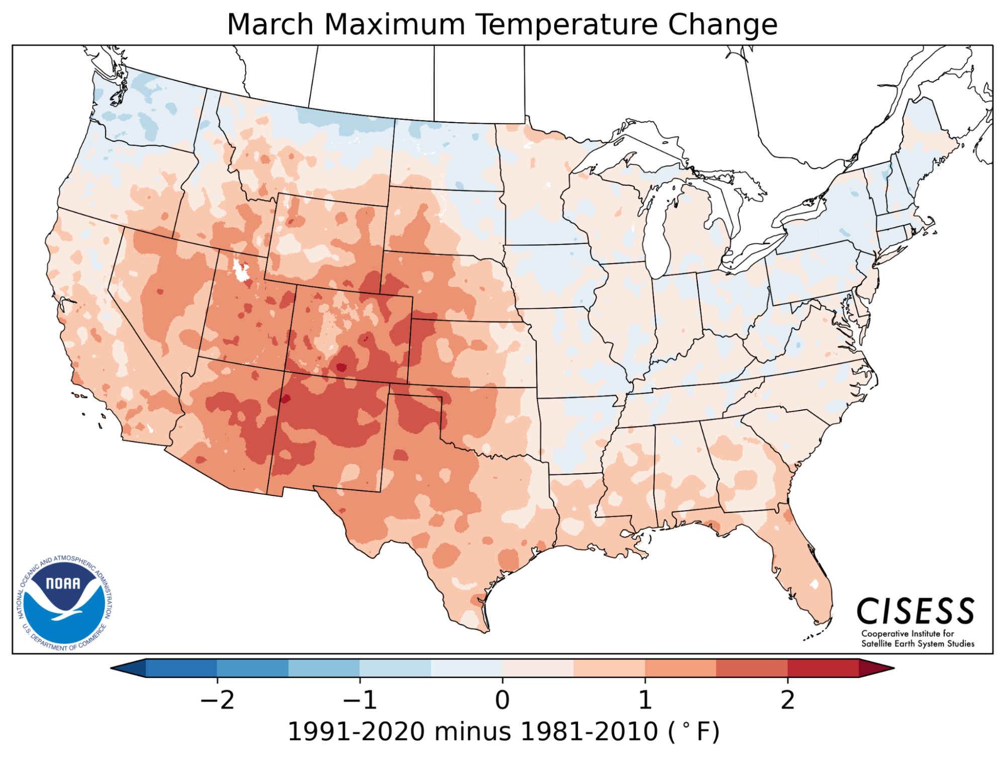
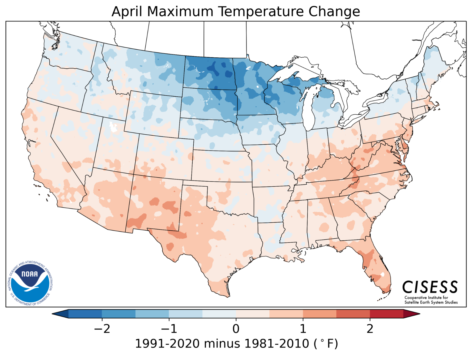
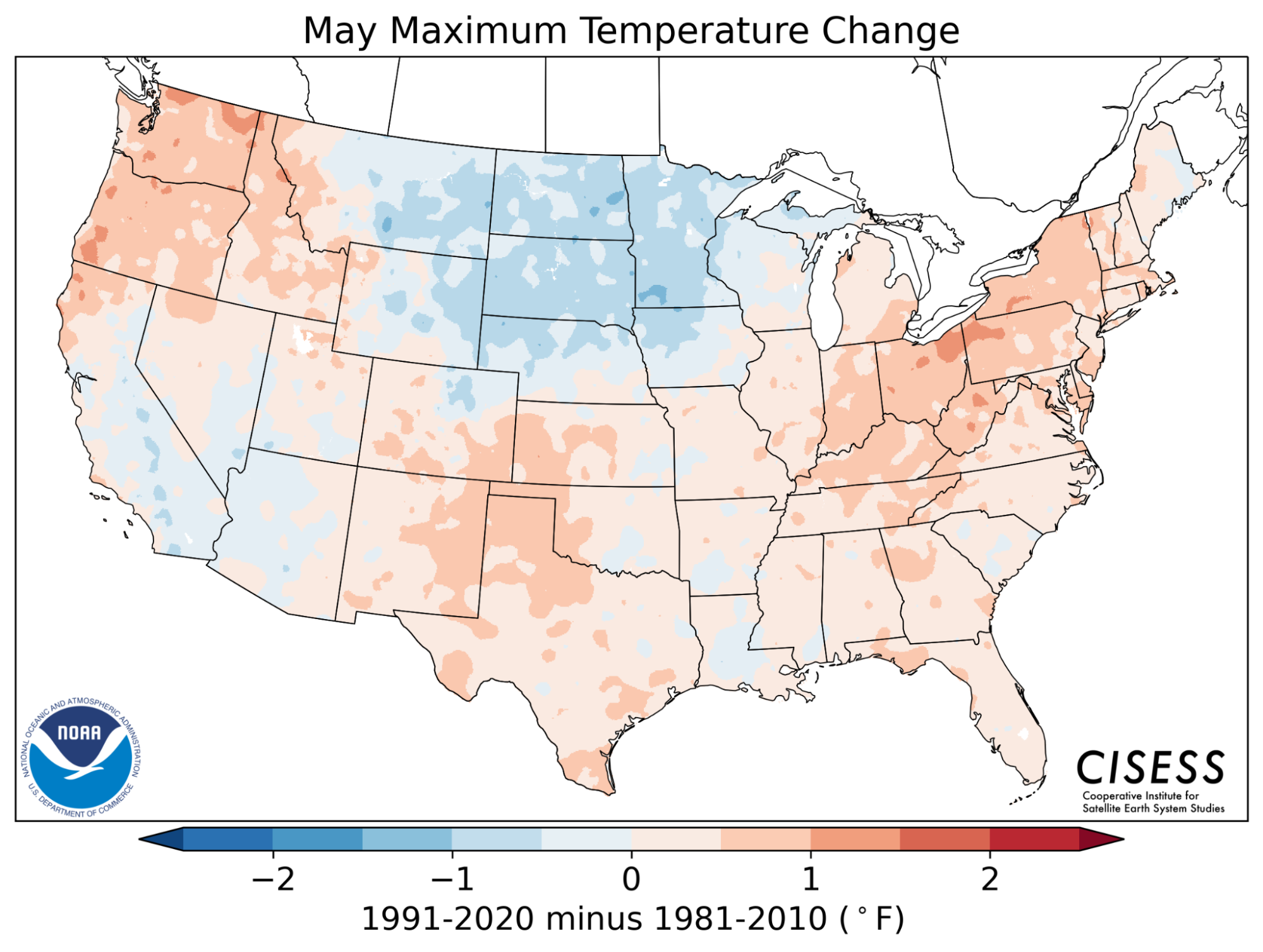
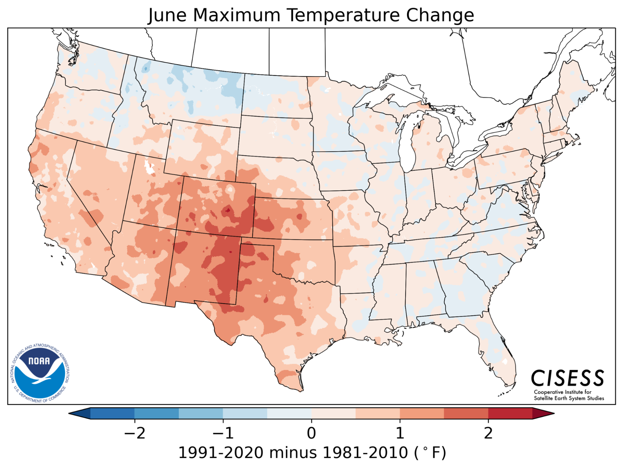
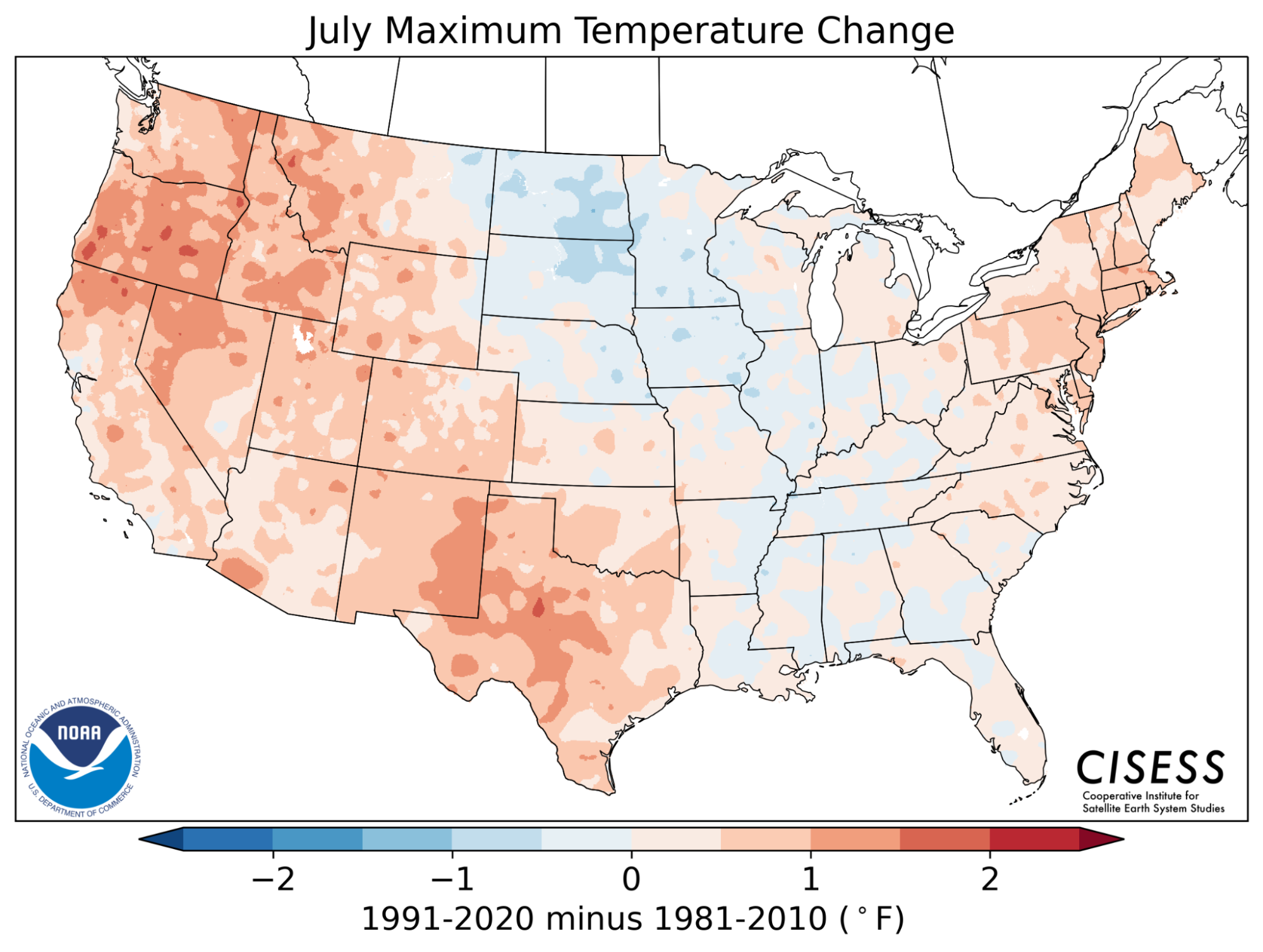
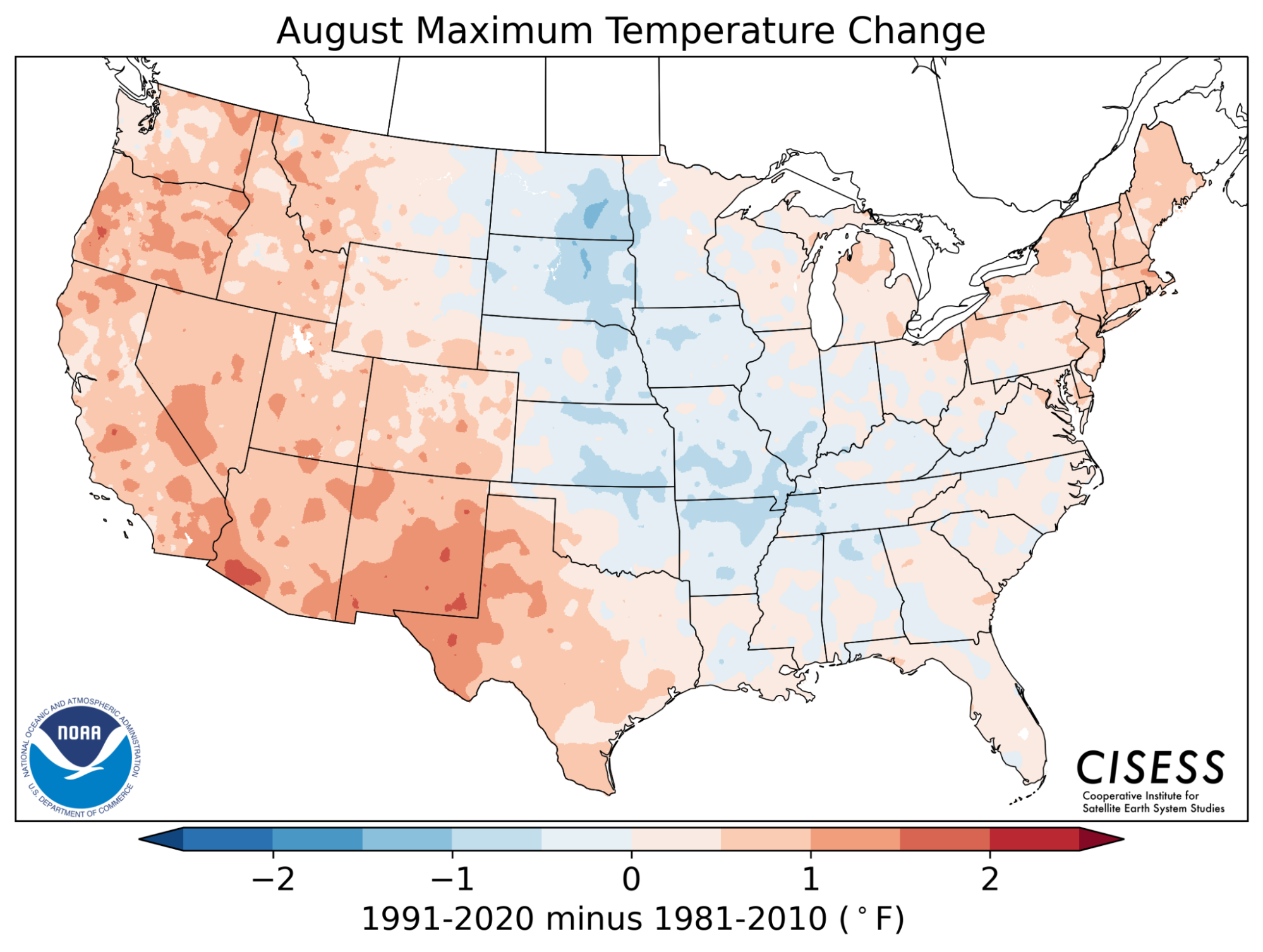
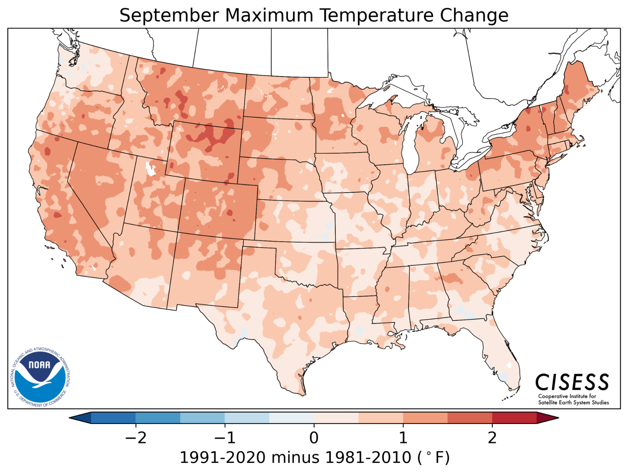
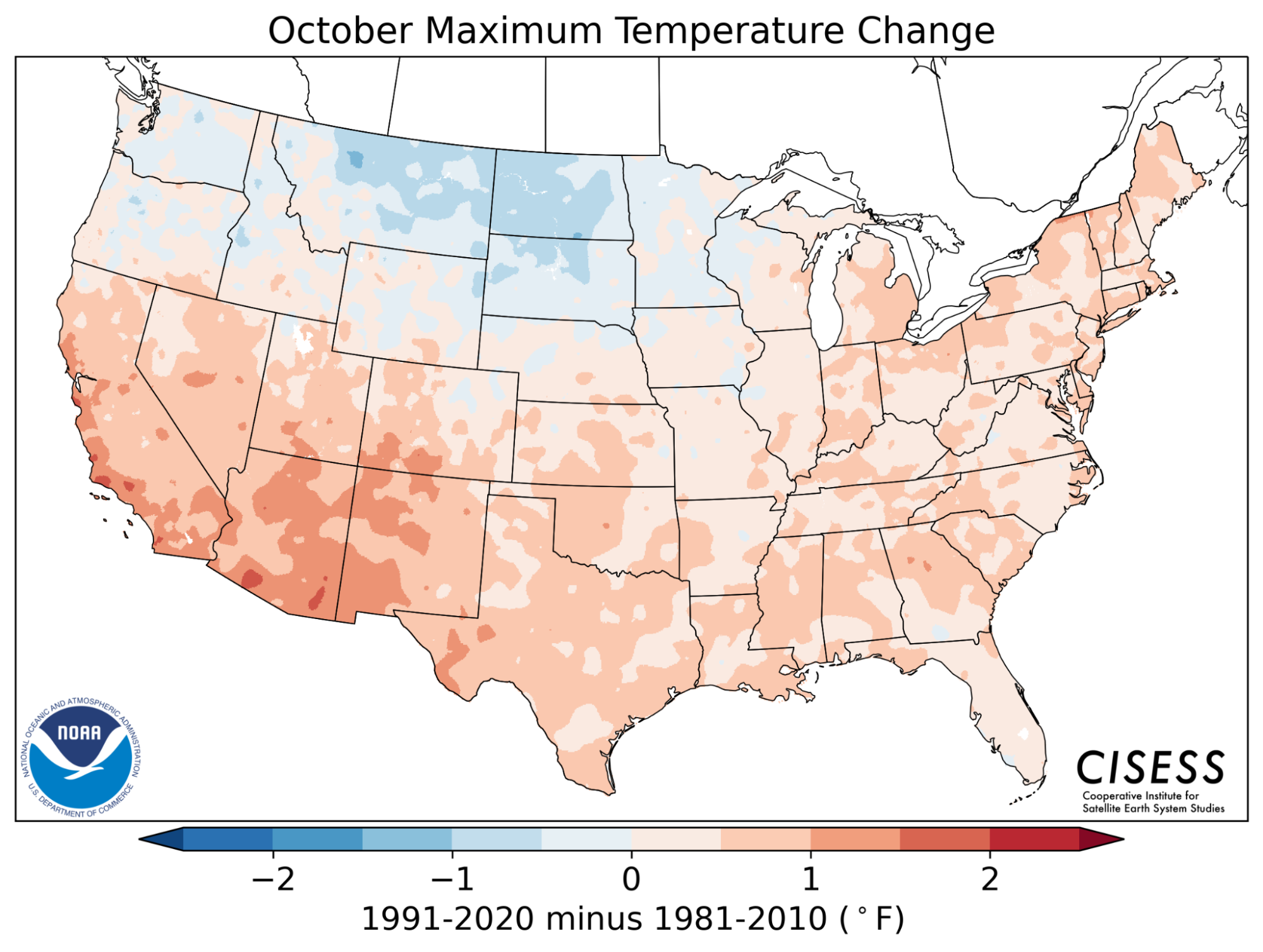
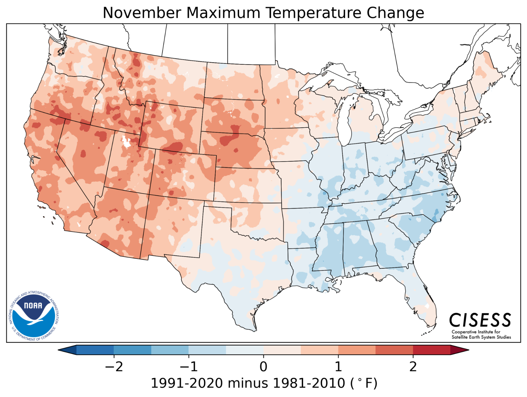
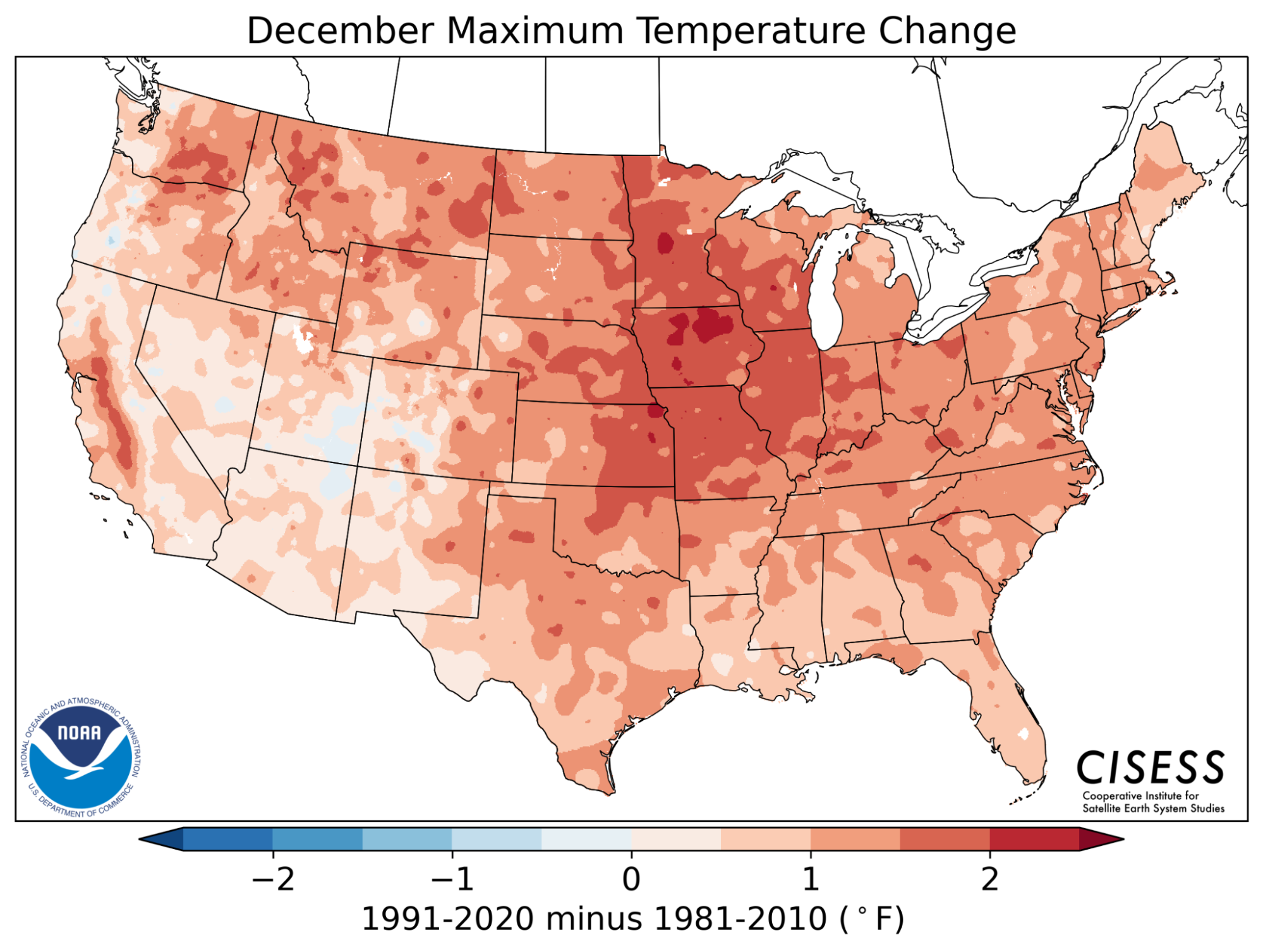
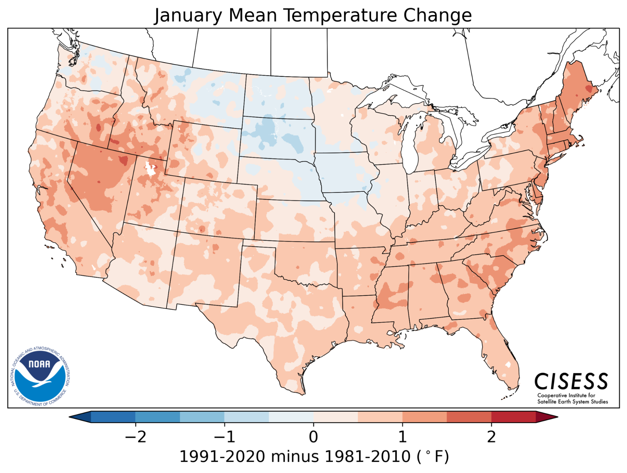
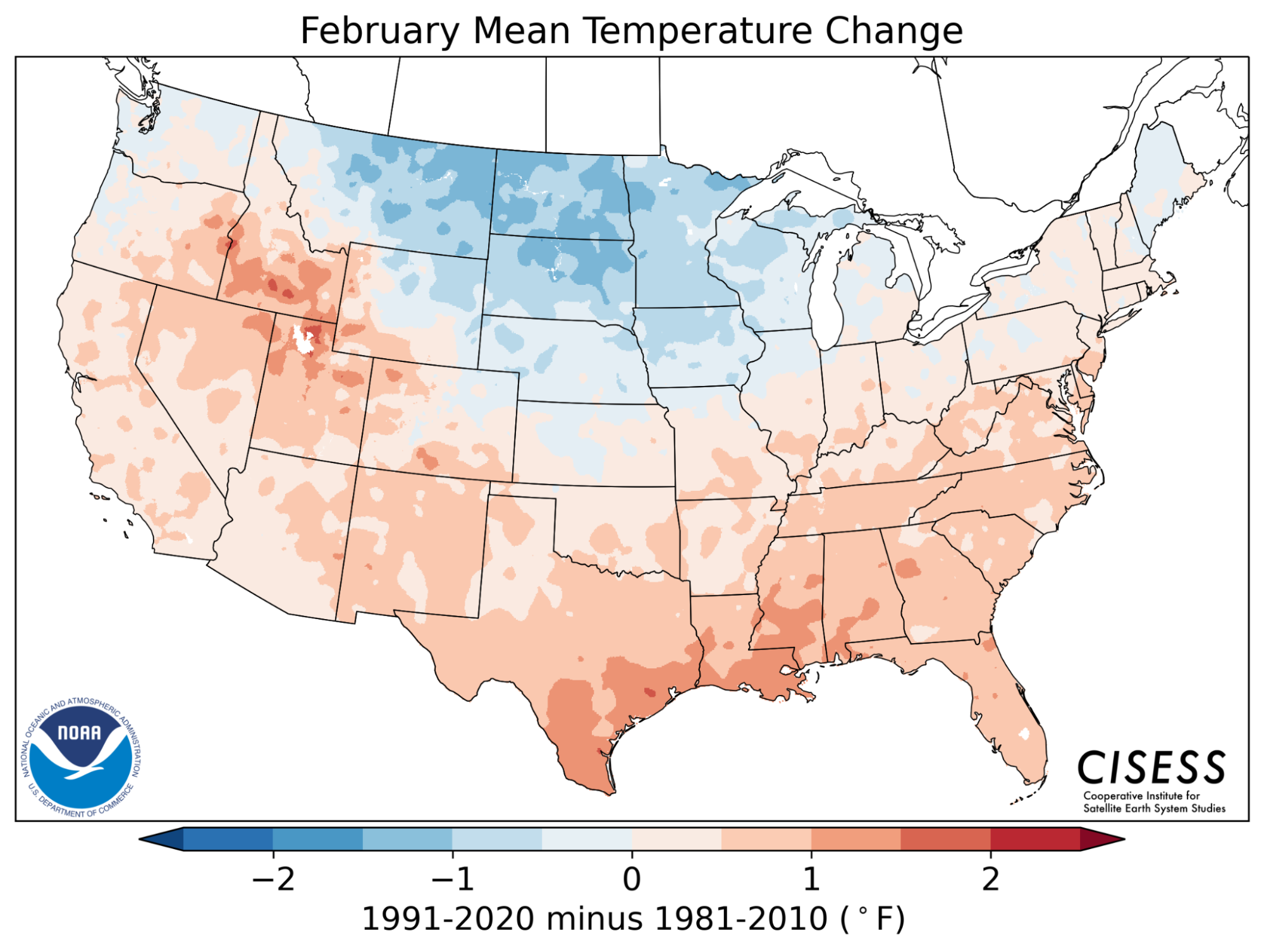
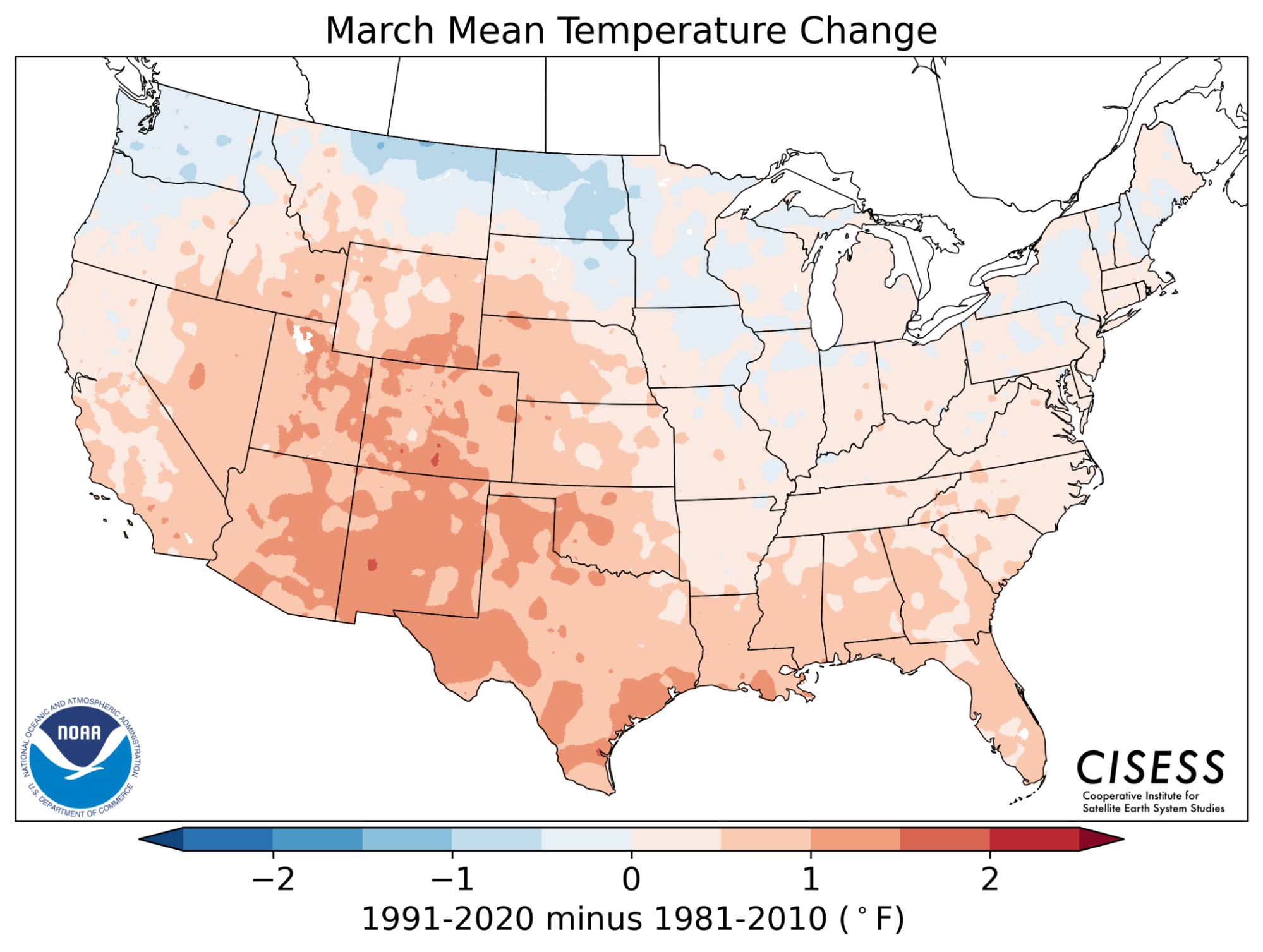
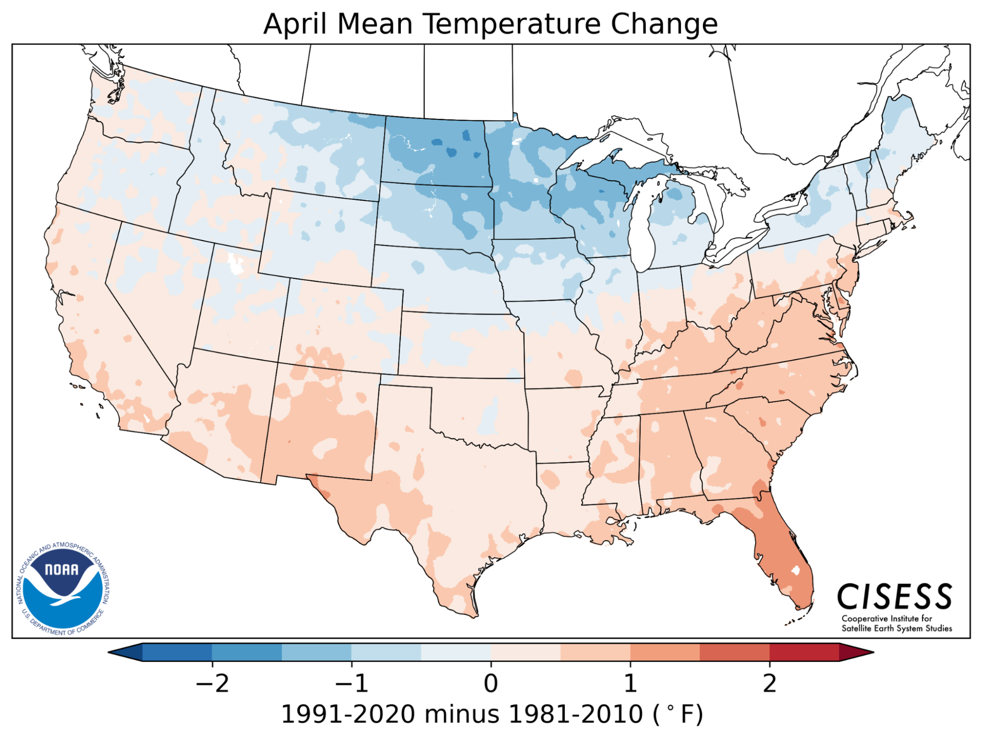
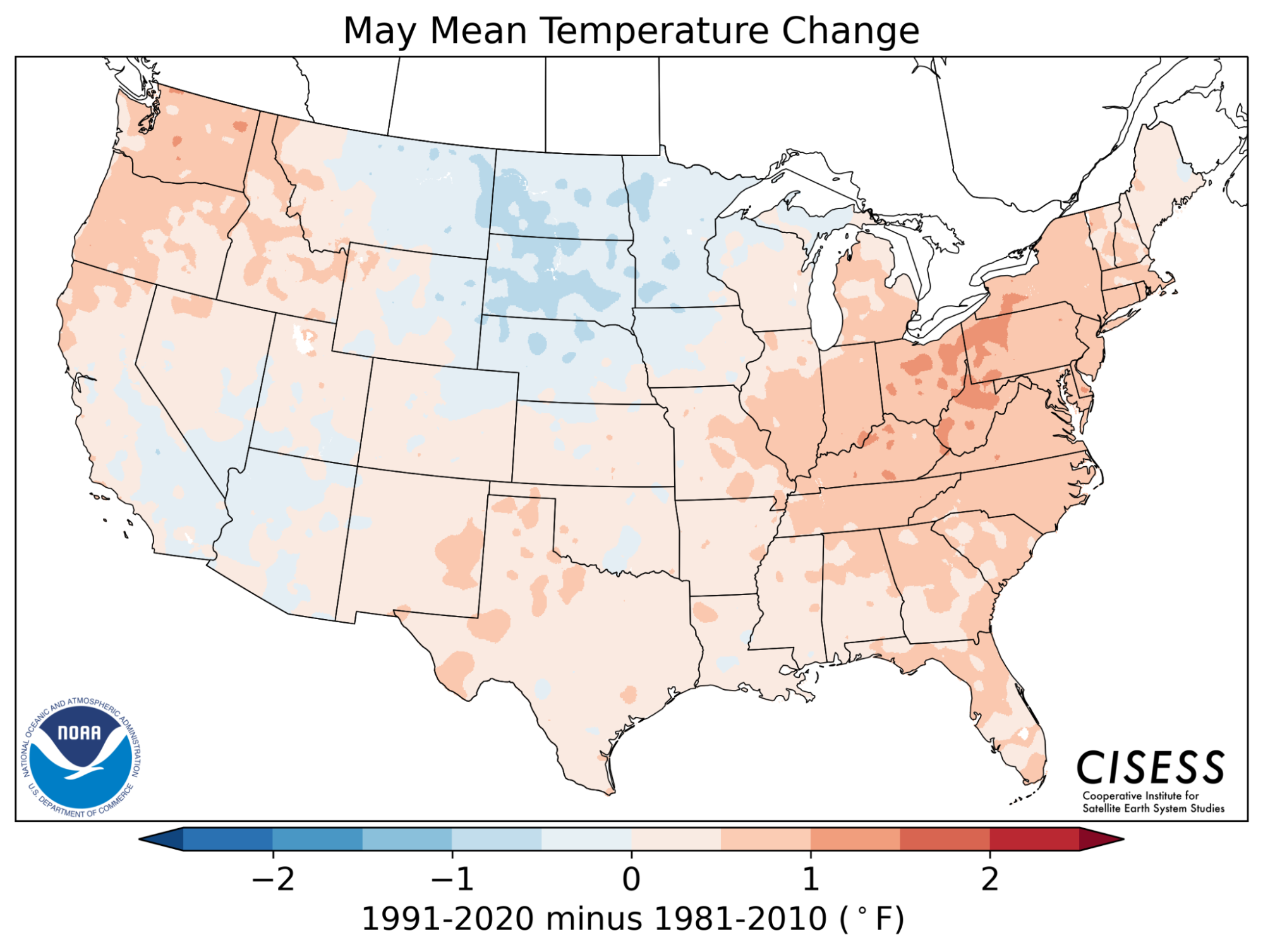
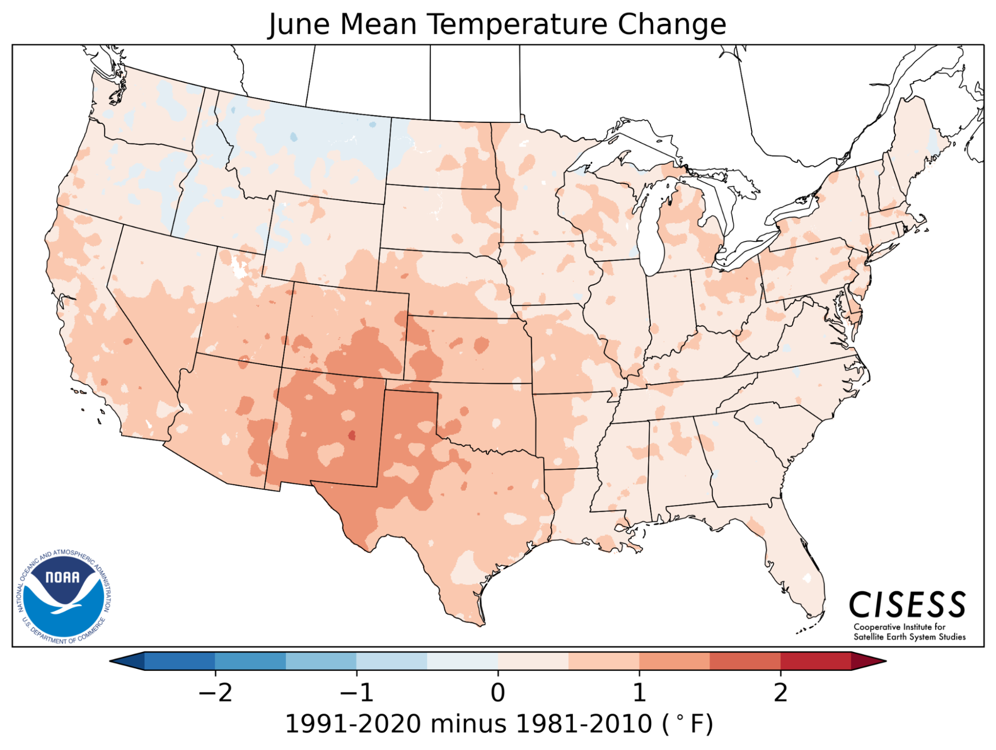
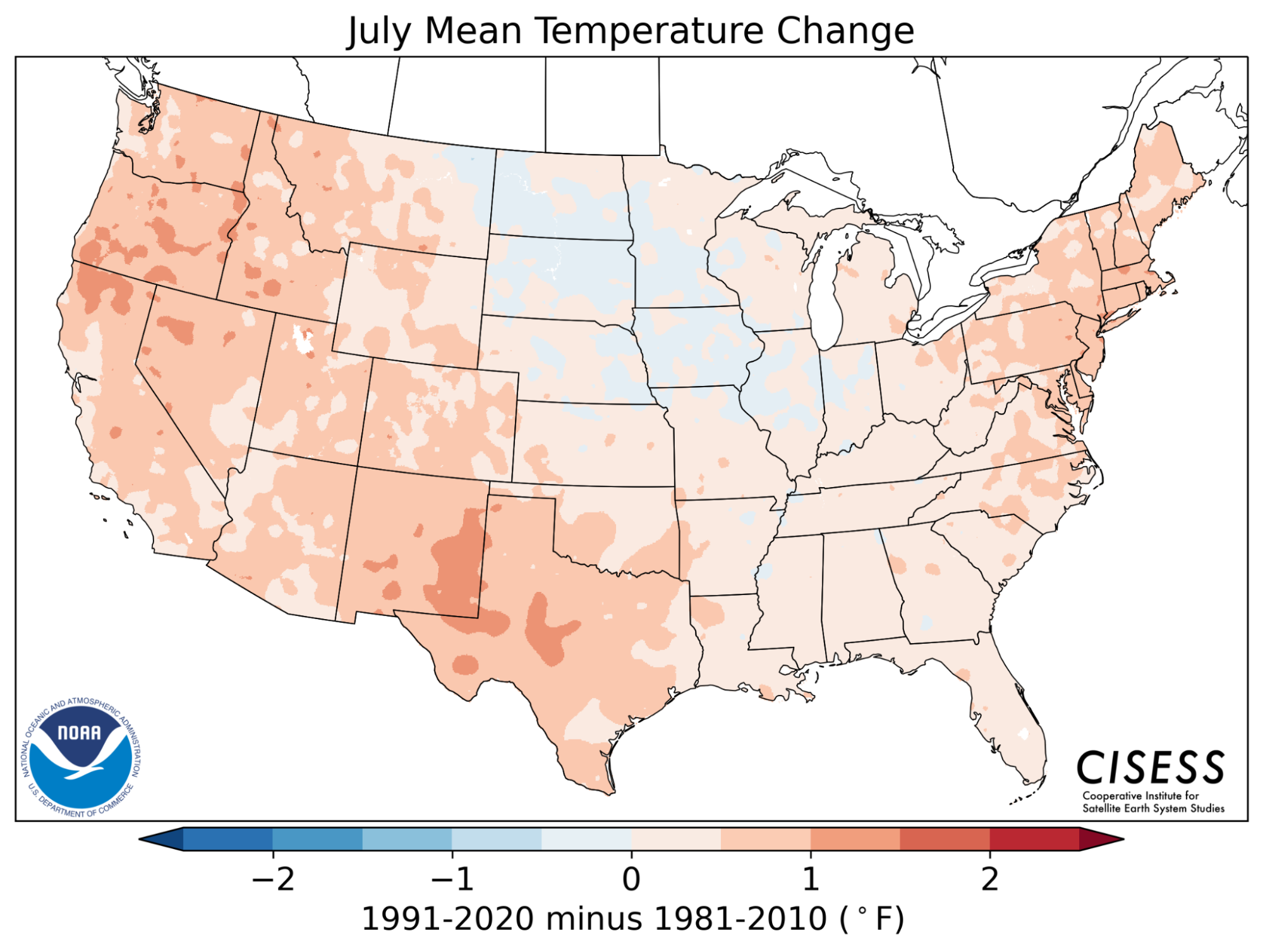
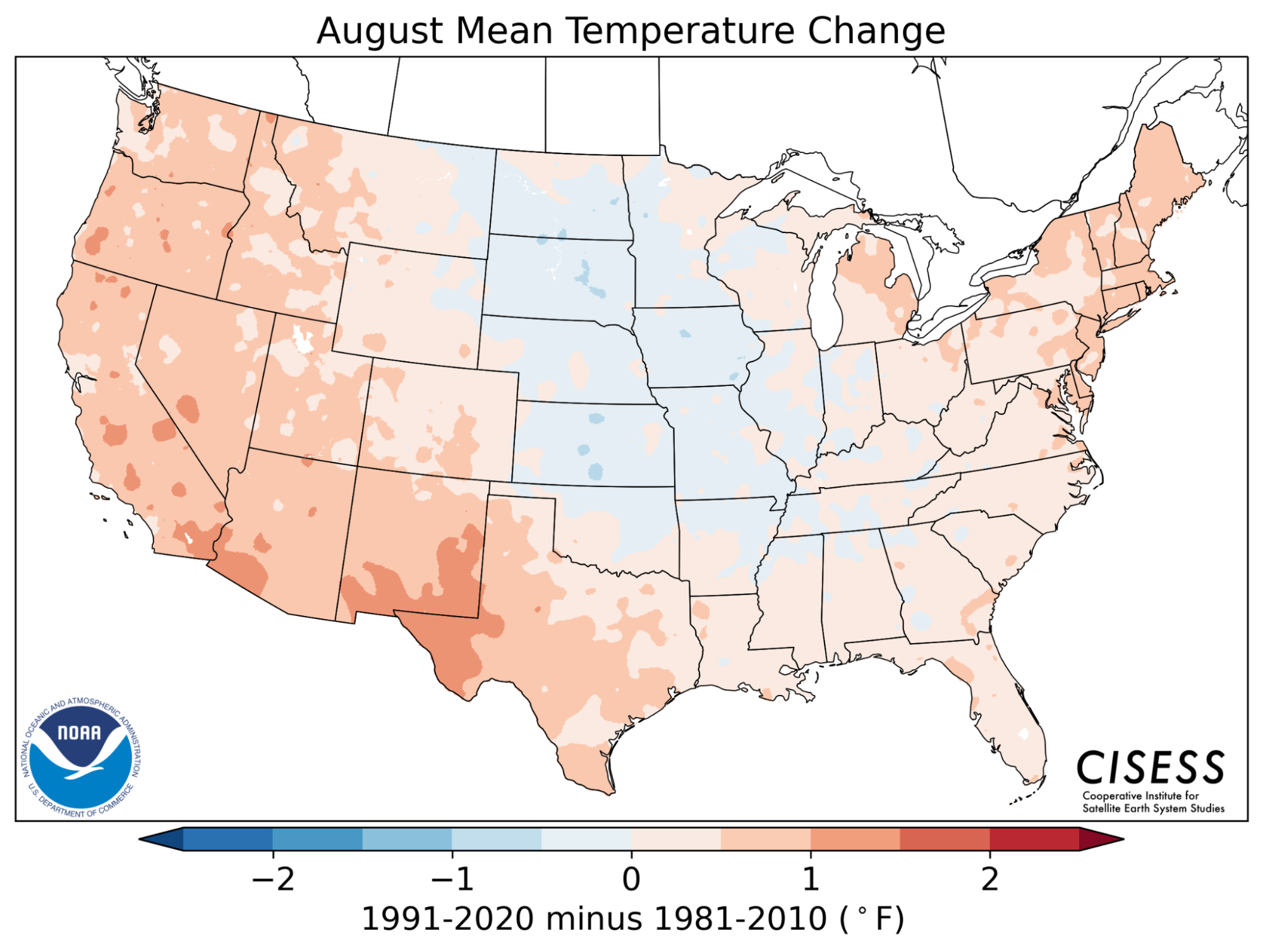
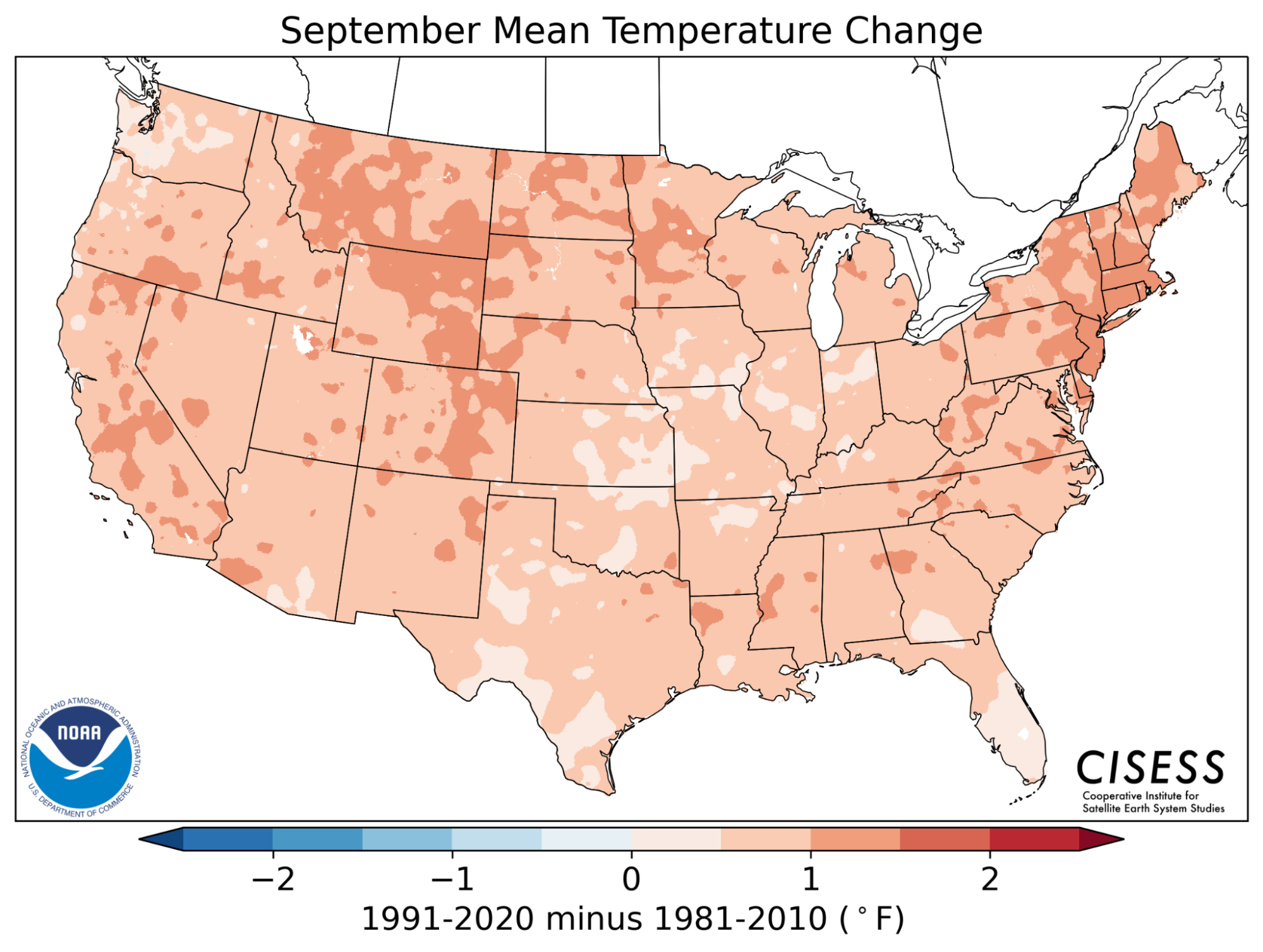
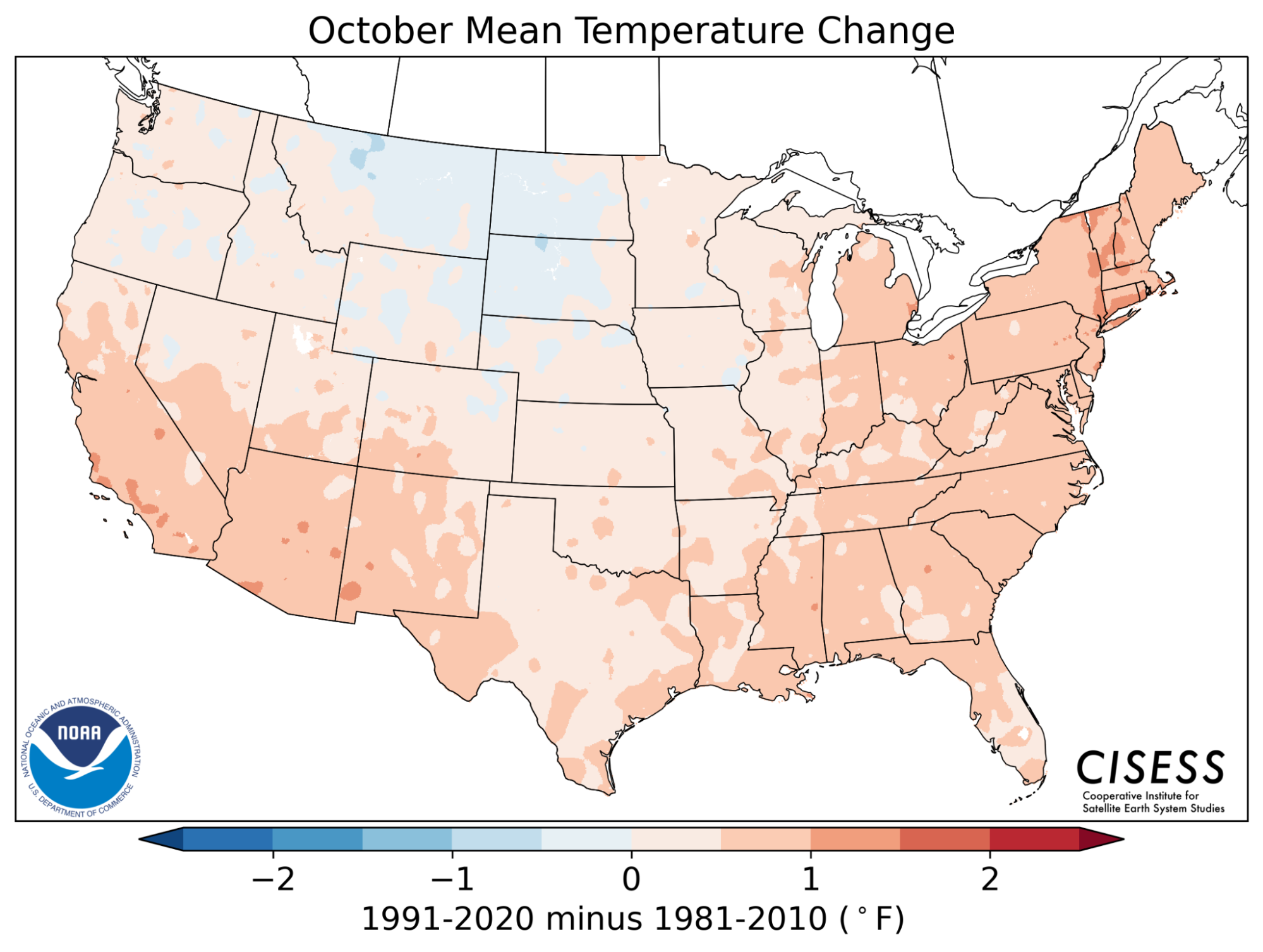
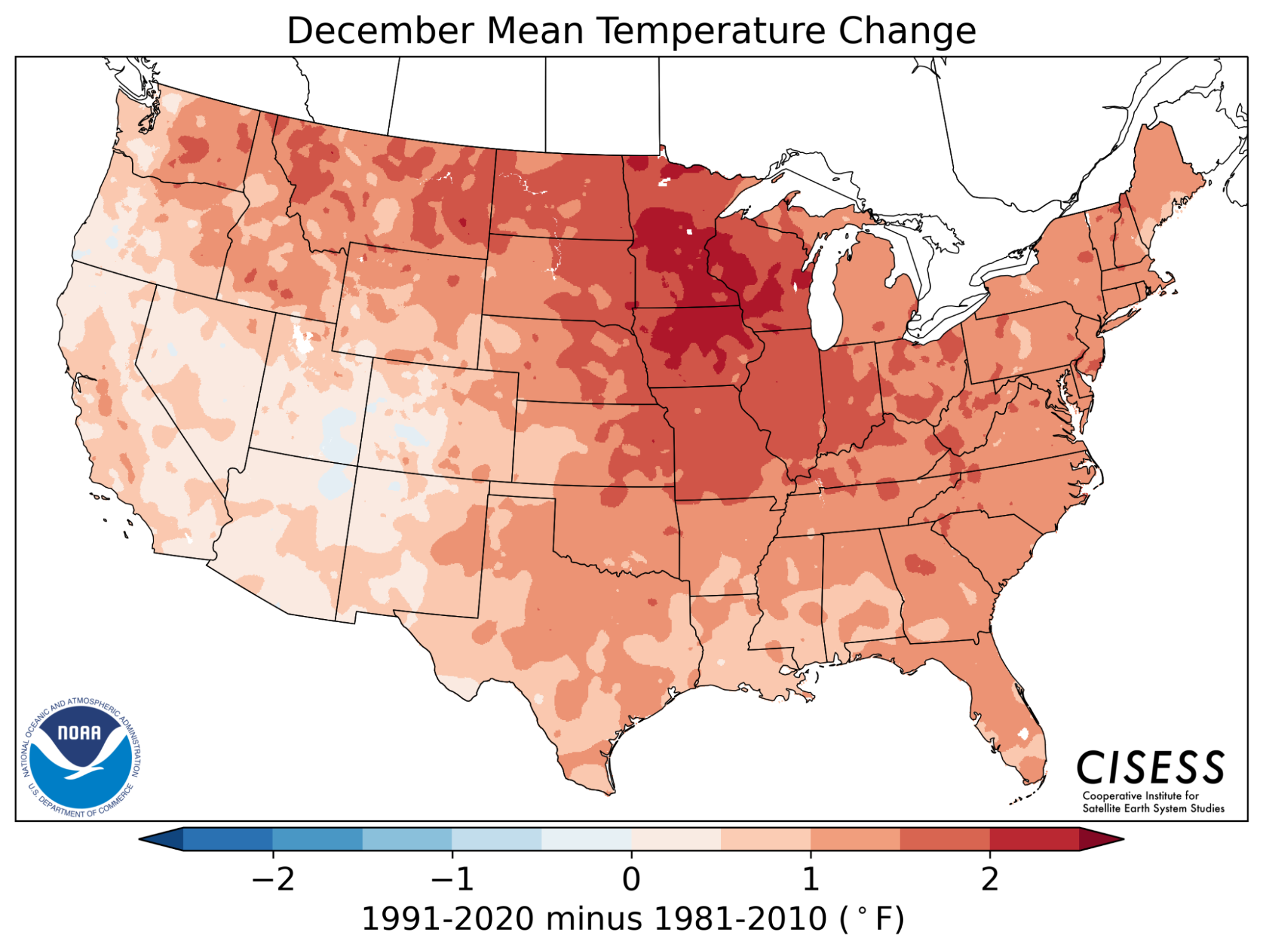
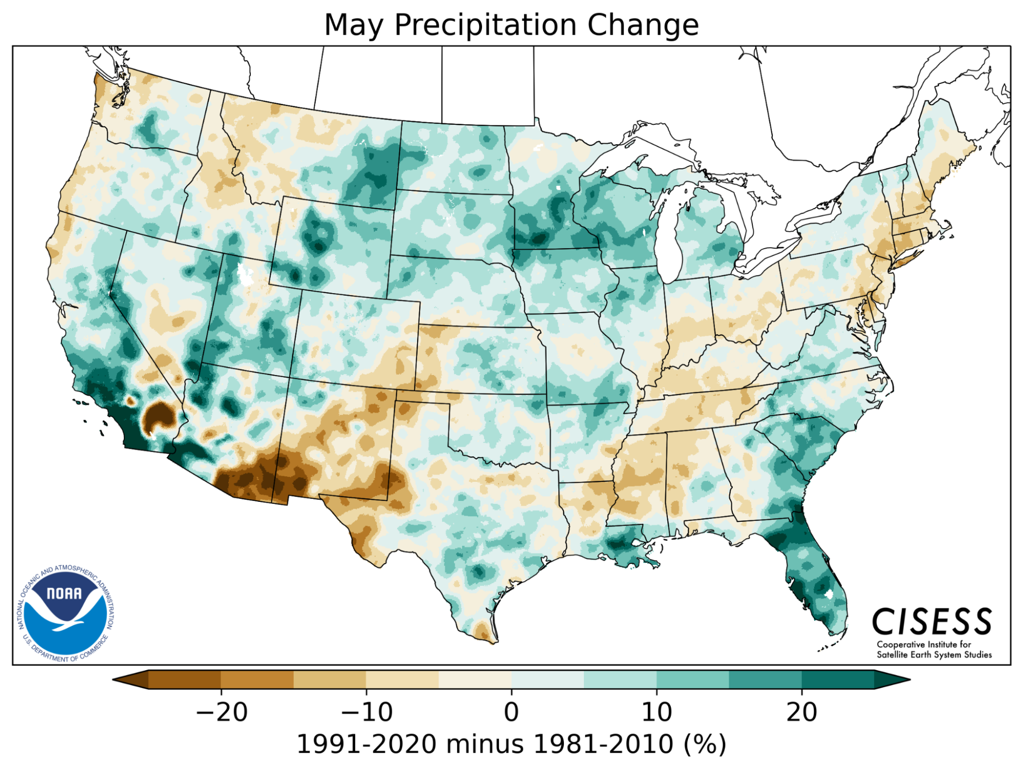
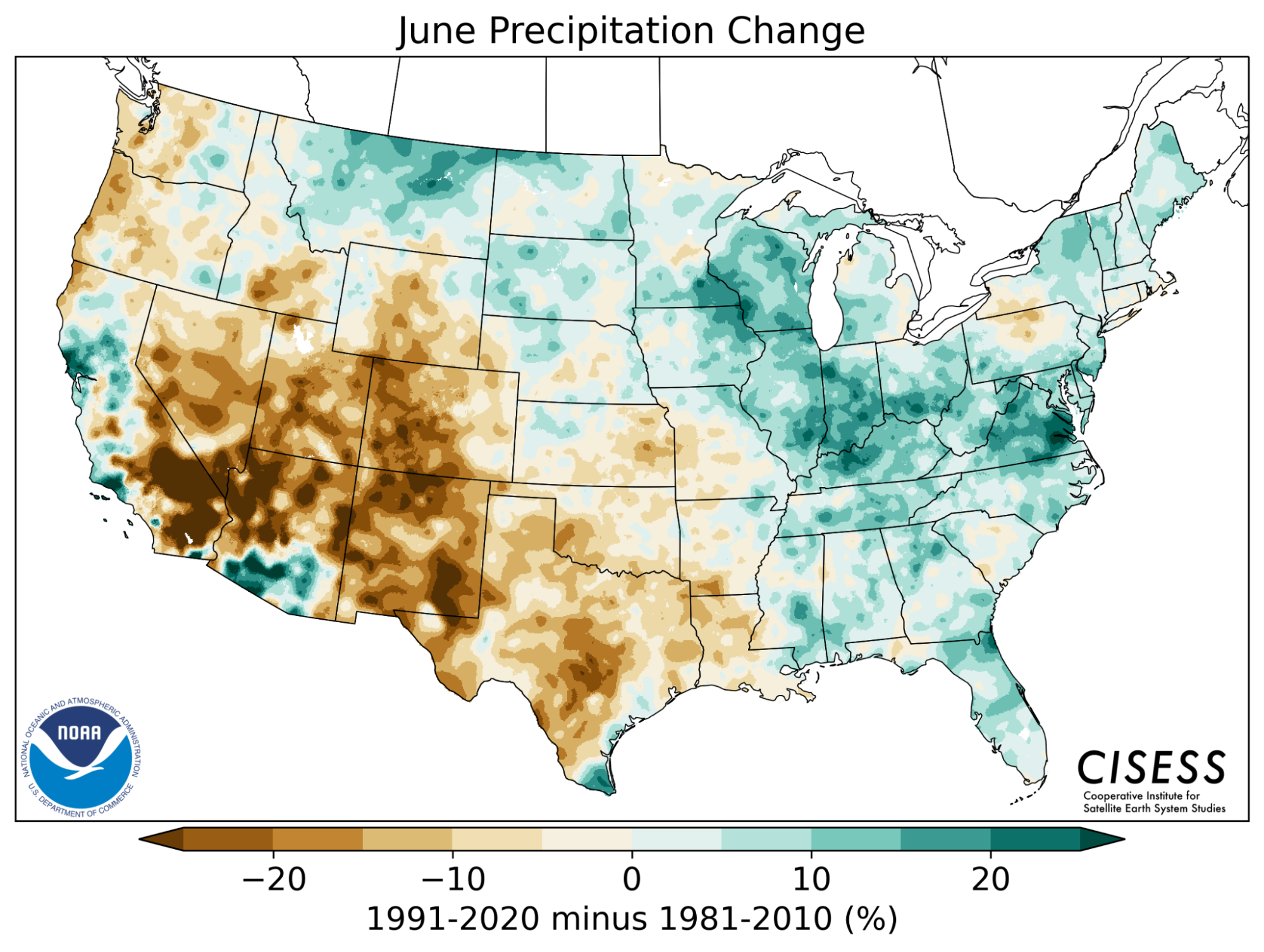
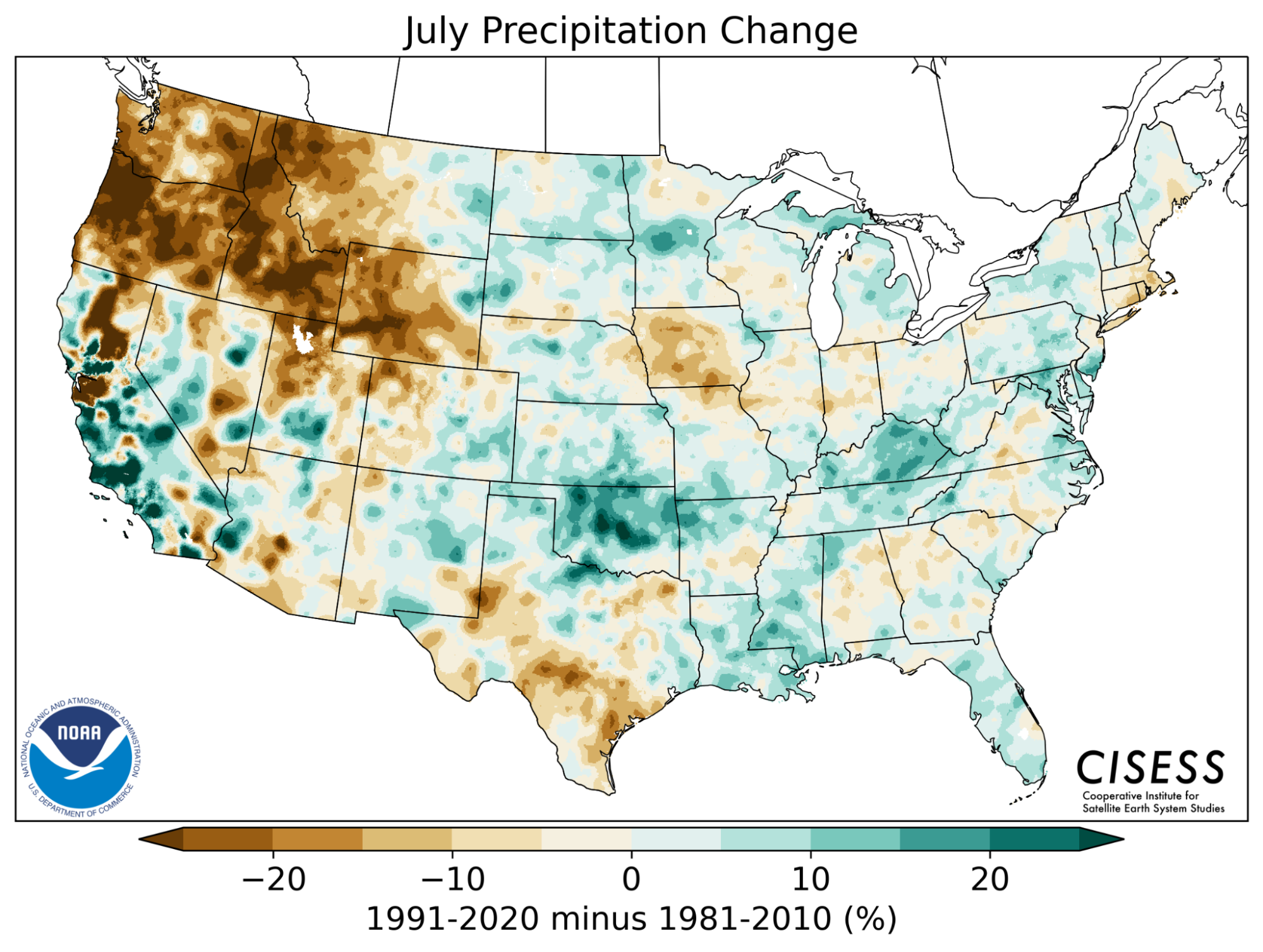
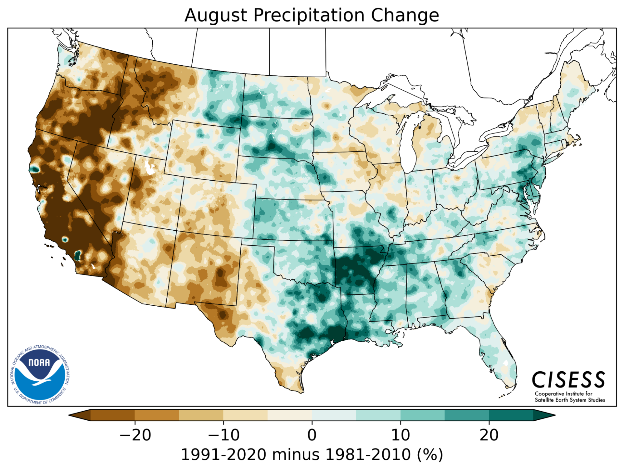
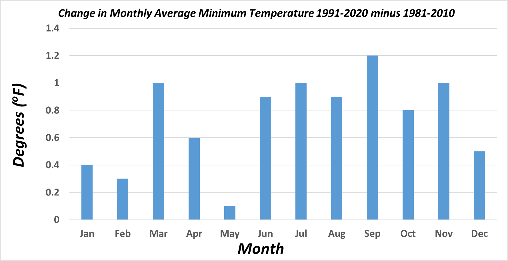
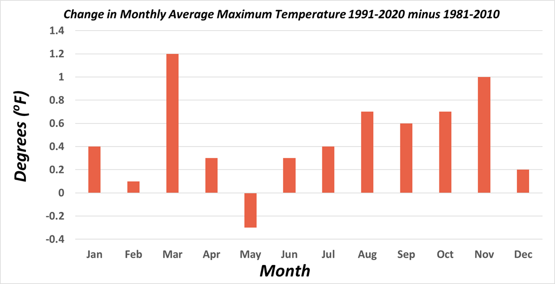
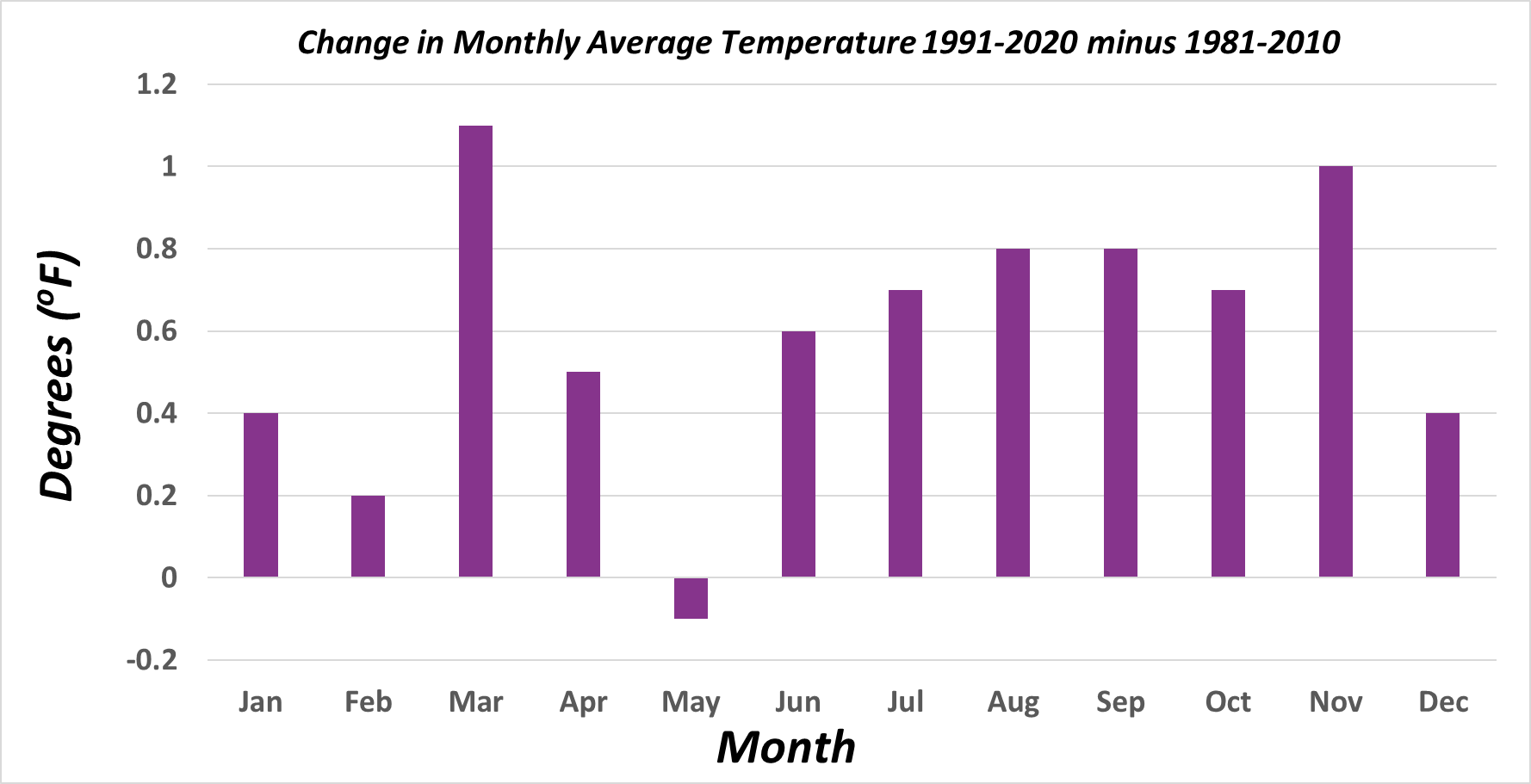
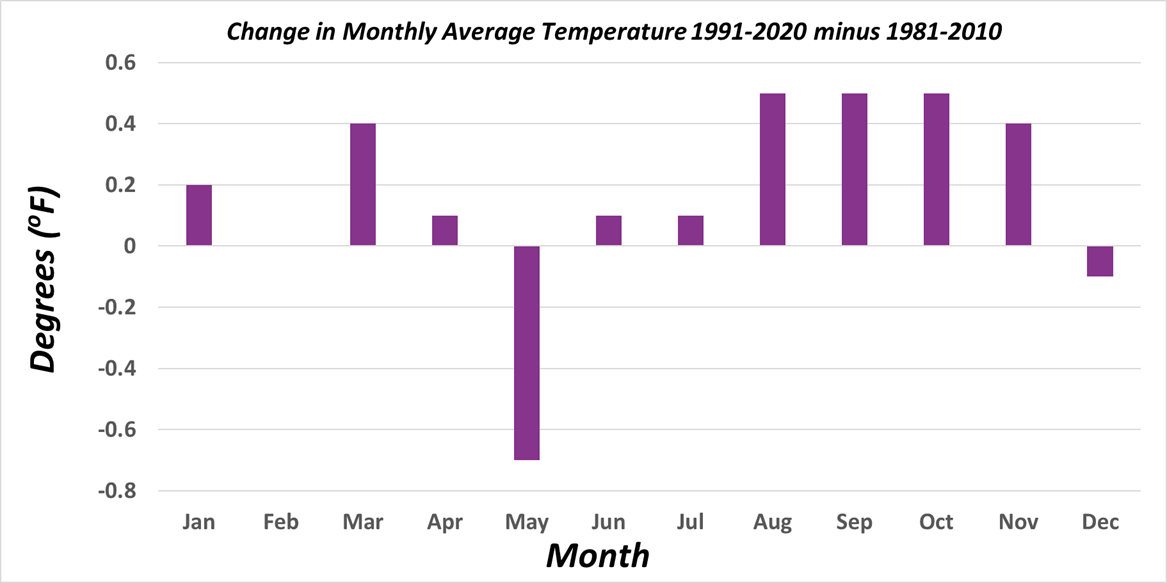
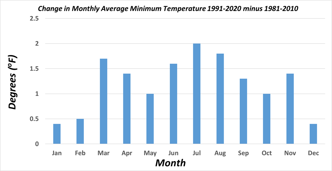
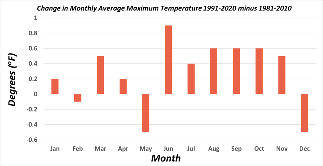
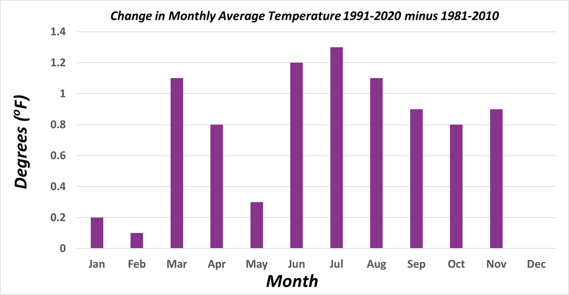
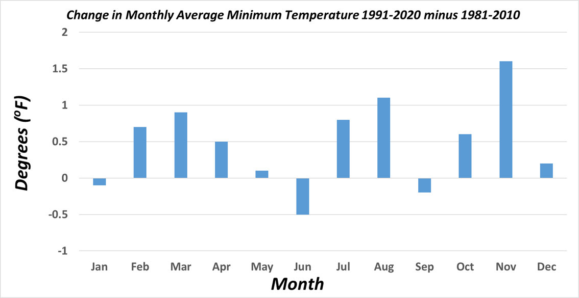
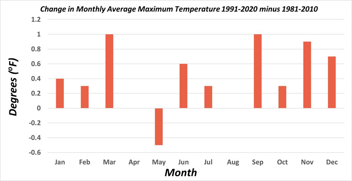
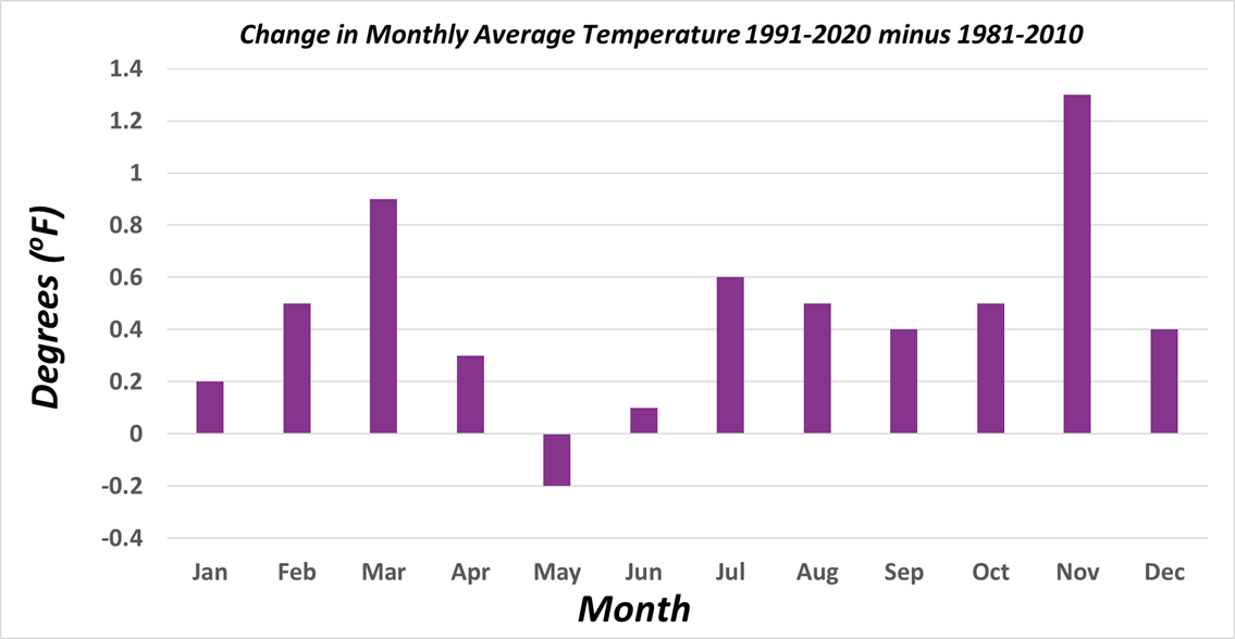
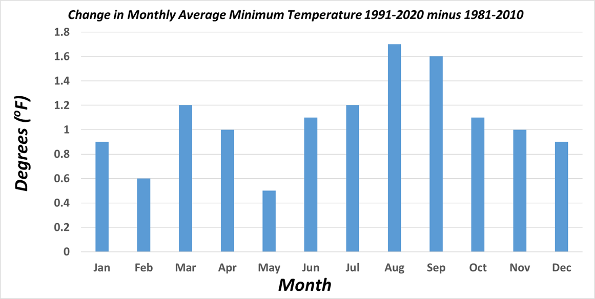
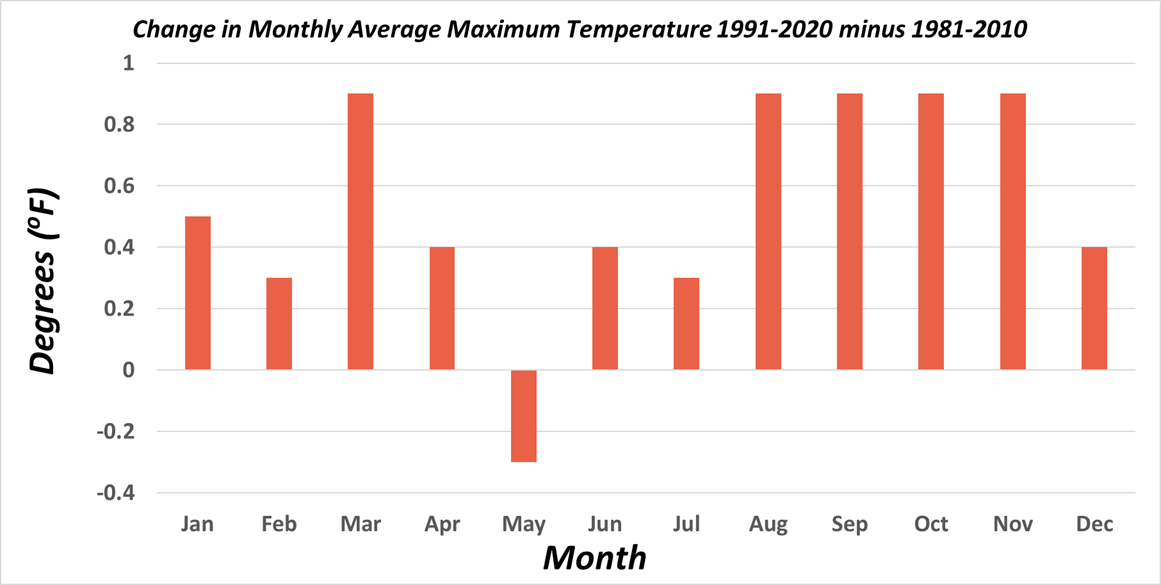
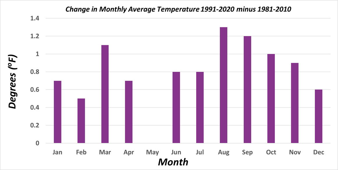
Breaking down the annual changes to the climate normals into monthly differences depicts far more temporal and spatial variability across the country. Some individual months stand out with unusually large changes (i.e. December temperatures), whereas some regions frequently oscillate between months with normals warmer than the 1981-2010 normals adjacent to months cooler than the 1981-2010 normals (i.e. northern Plains in late spring and the Southeast in autumn). In the Southwest, the average monthly temperature increased for every month except May. In this case, a few May months in the past decade that were significantly cooler replaced warmer May months in the 1980s. This is not believed to be a long term trend, but rather a case where even the shorter term variability of weather becomes reflected in the climate time scale. However, the general overall trend of warming can easily be seen in the Southwest through these monthly changes.
|
|
|
|
|
|
|
|
|
|
|
|
|
|
|
|
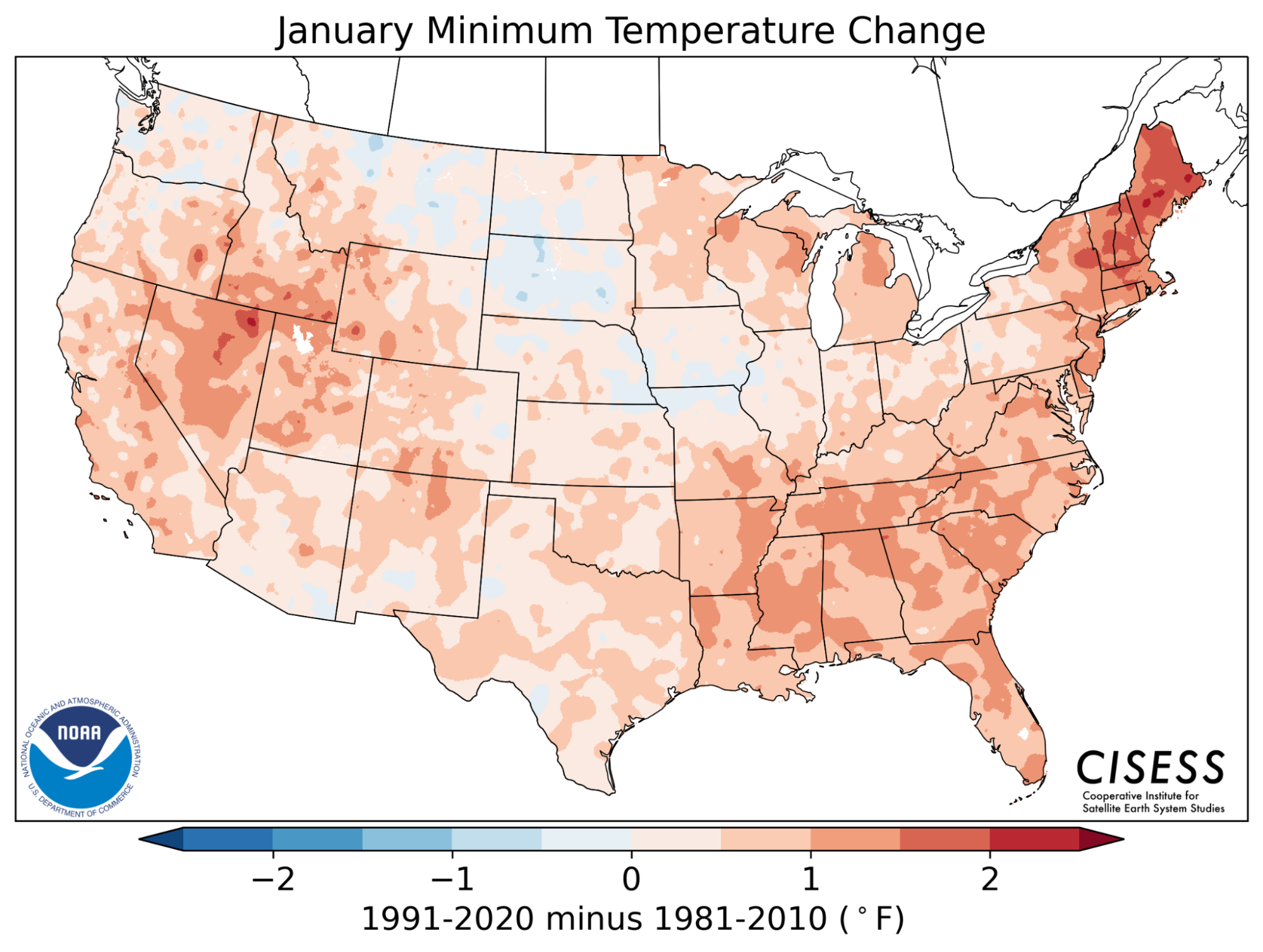
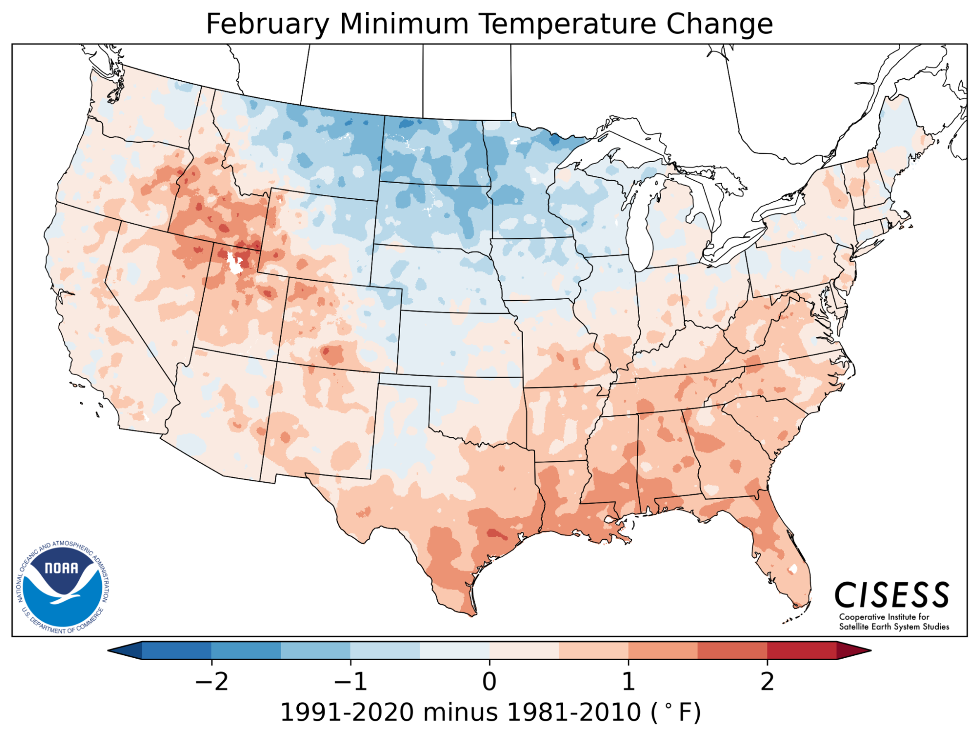
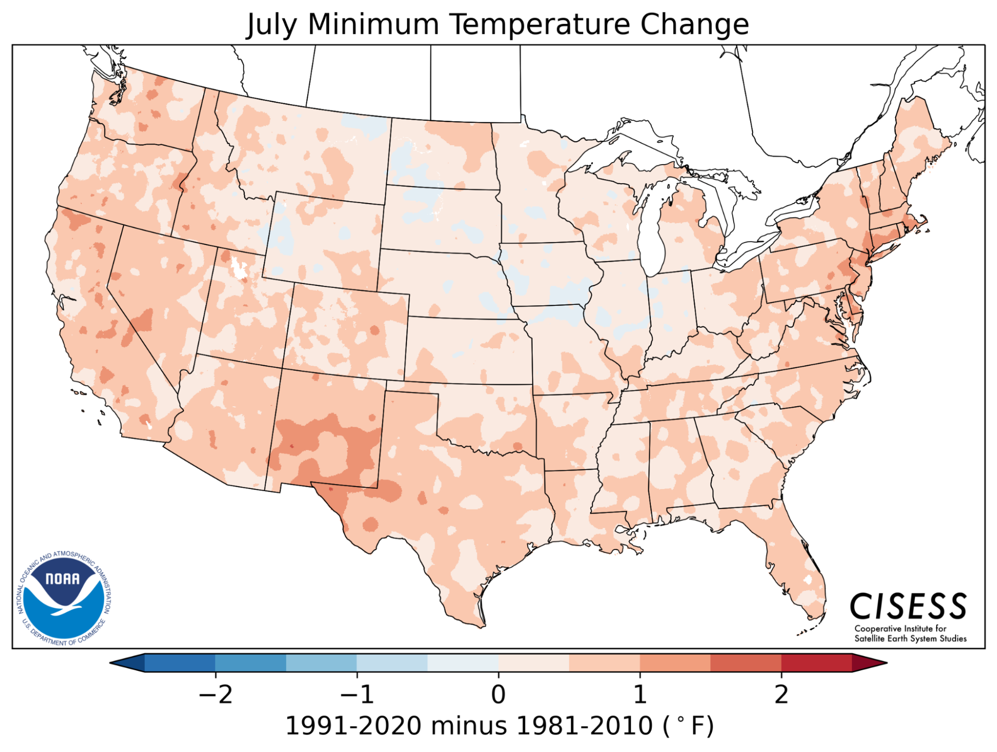
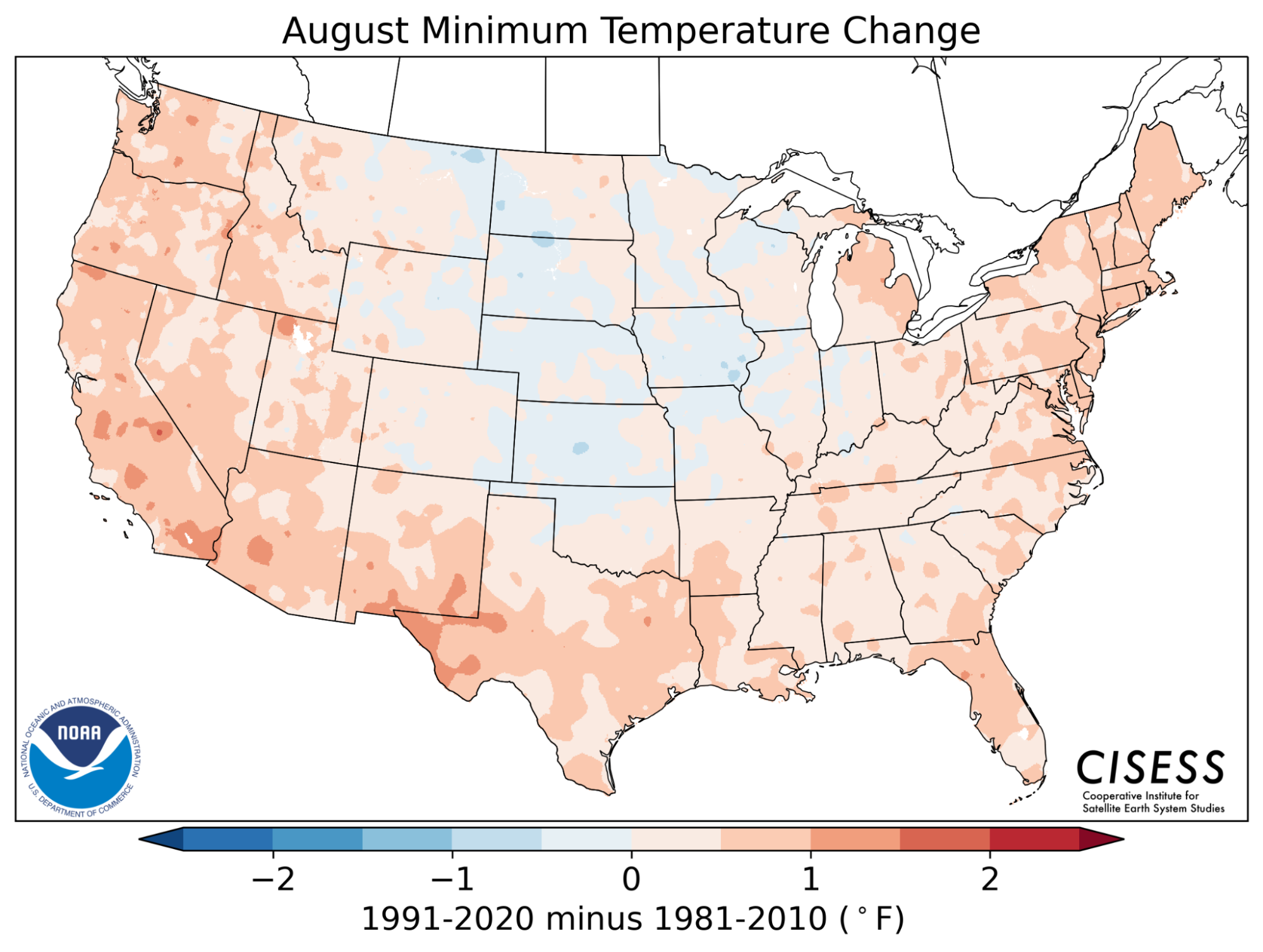
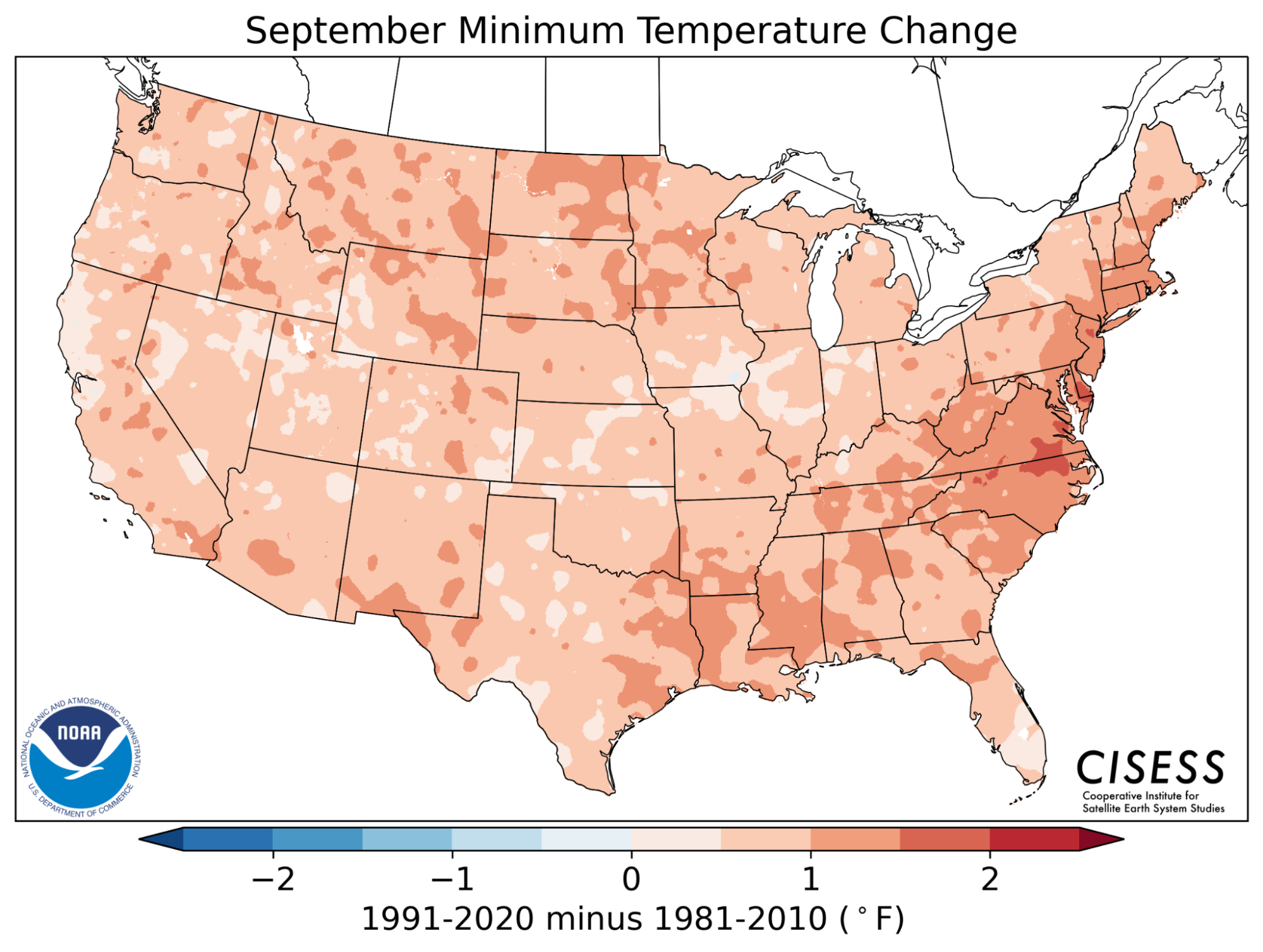
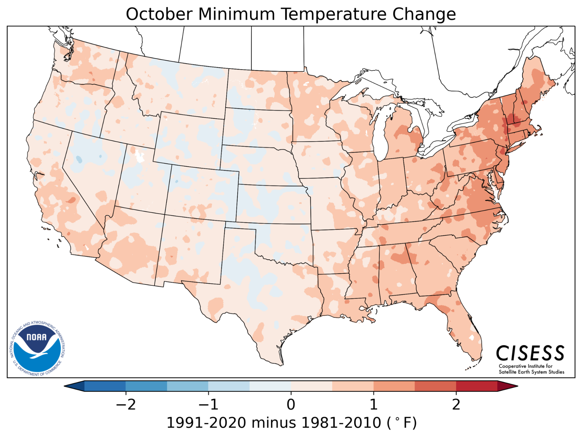
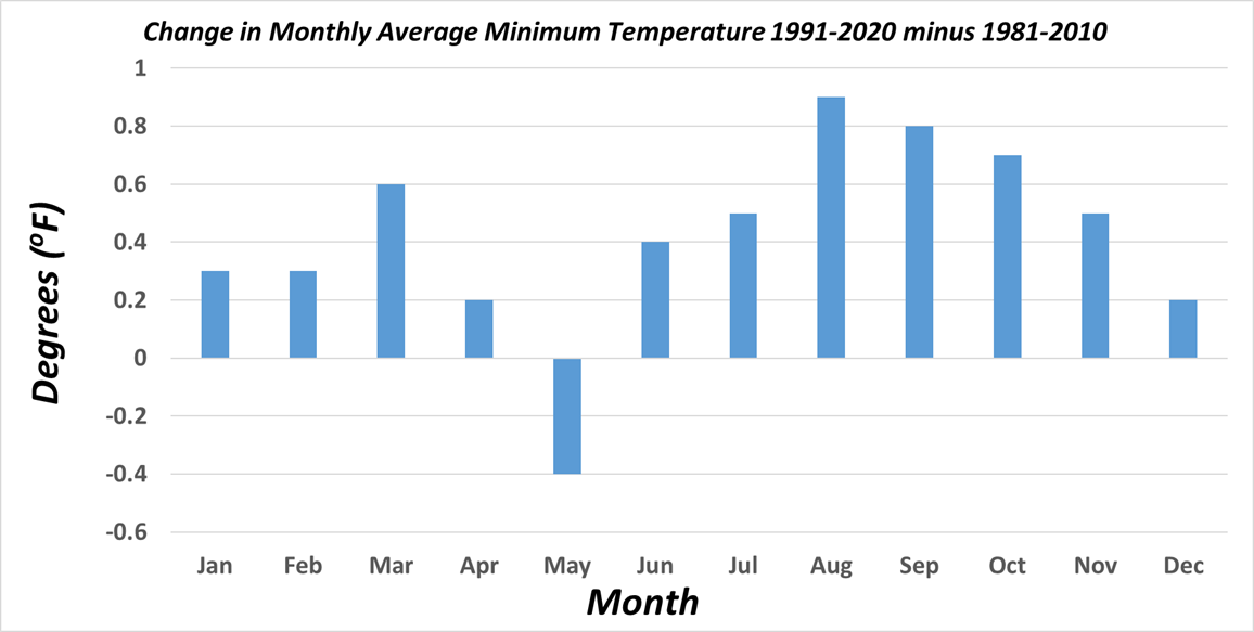
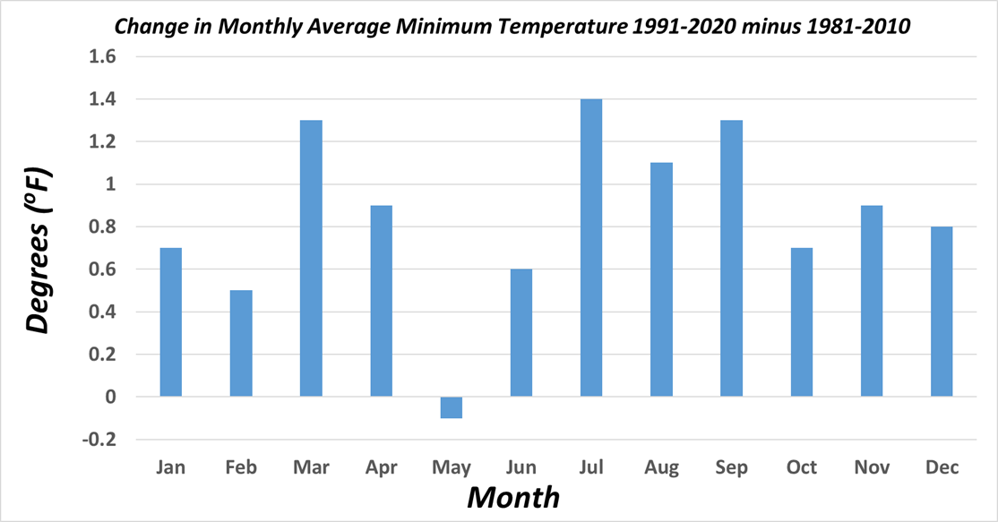
Monthly changes in Average Minimum Temperature from 1981-2010 to 1991-2020. (Click for full-resolution.)
|
|
|
|
|
|
|
|
|
|
|
|
|
|
|
|
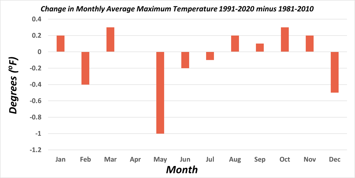
Monthly changes in Average Maximum Temperature from 1981-2010 to 1991-2020. (Click for full-resolution.)
|
|
|
|
|
|
|
|
|
|
|
|
|
|
|
|
Monthly changes in Average Temperature from 1981-2010 to 1991-2020. (Click for full-resolution.)
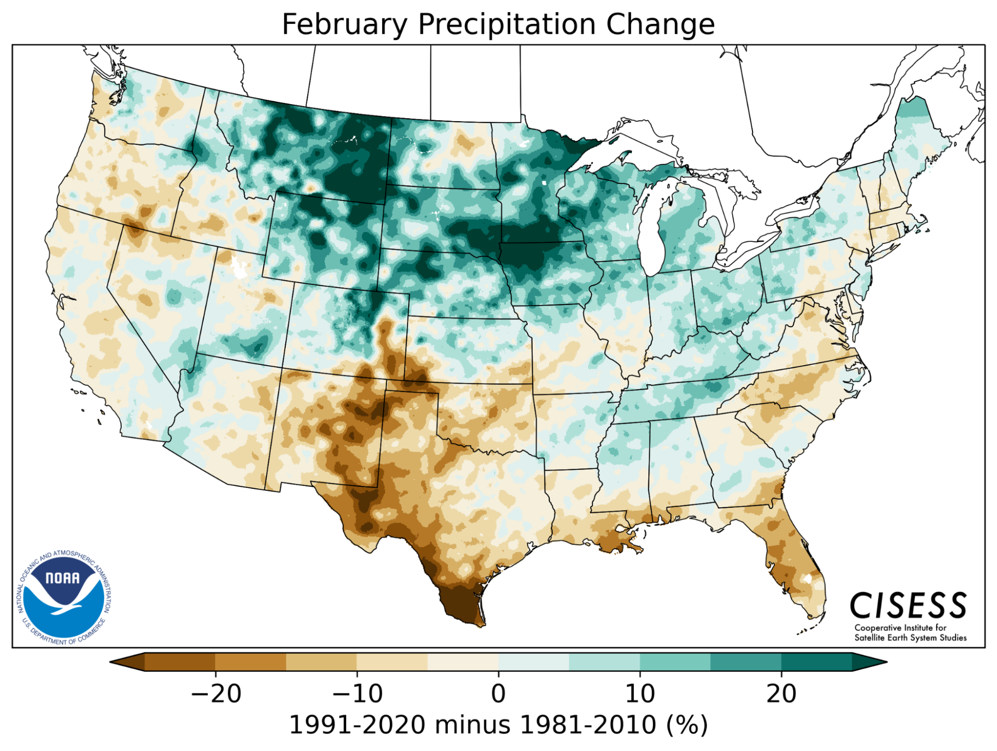
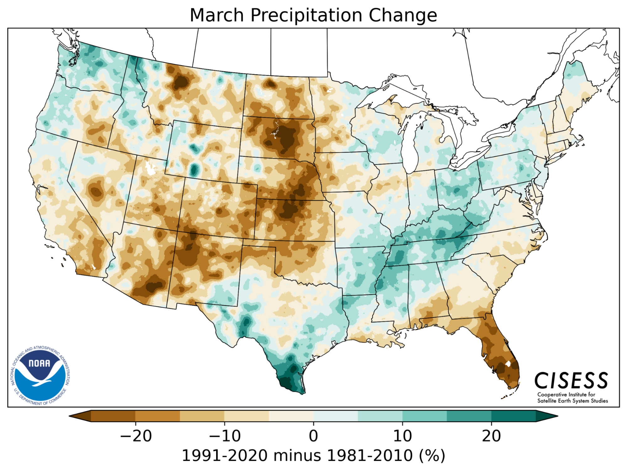
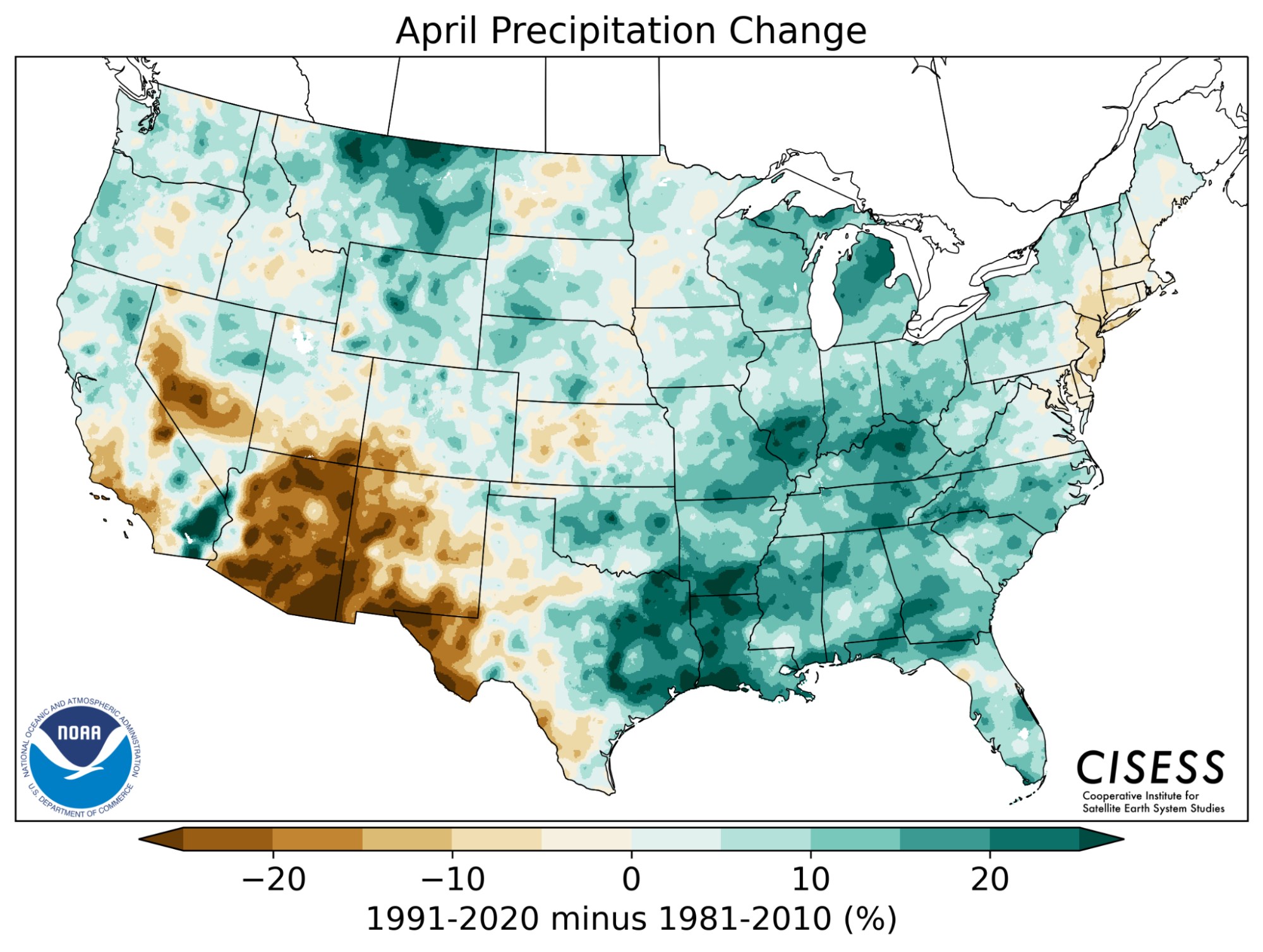
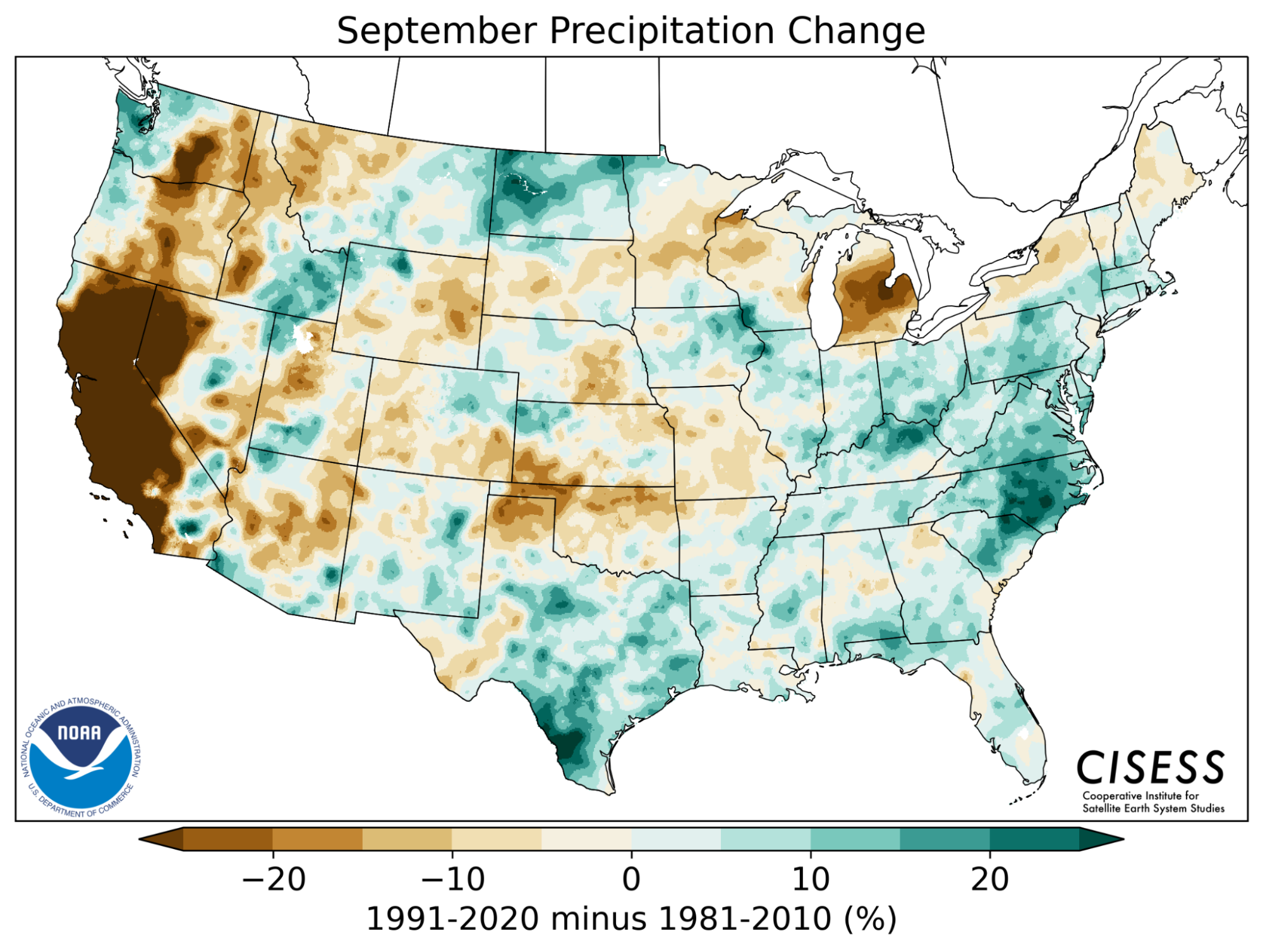
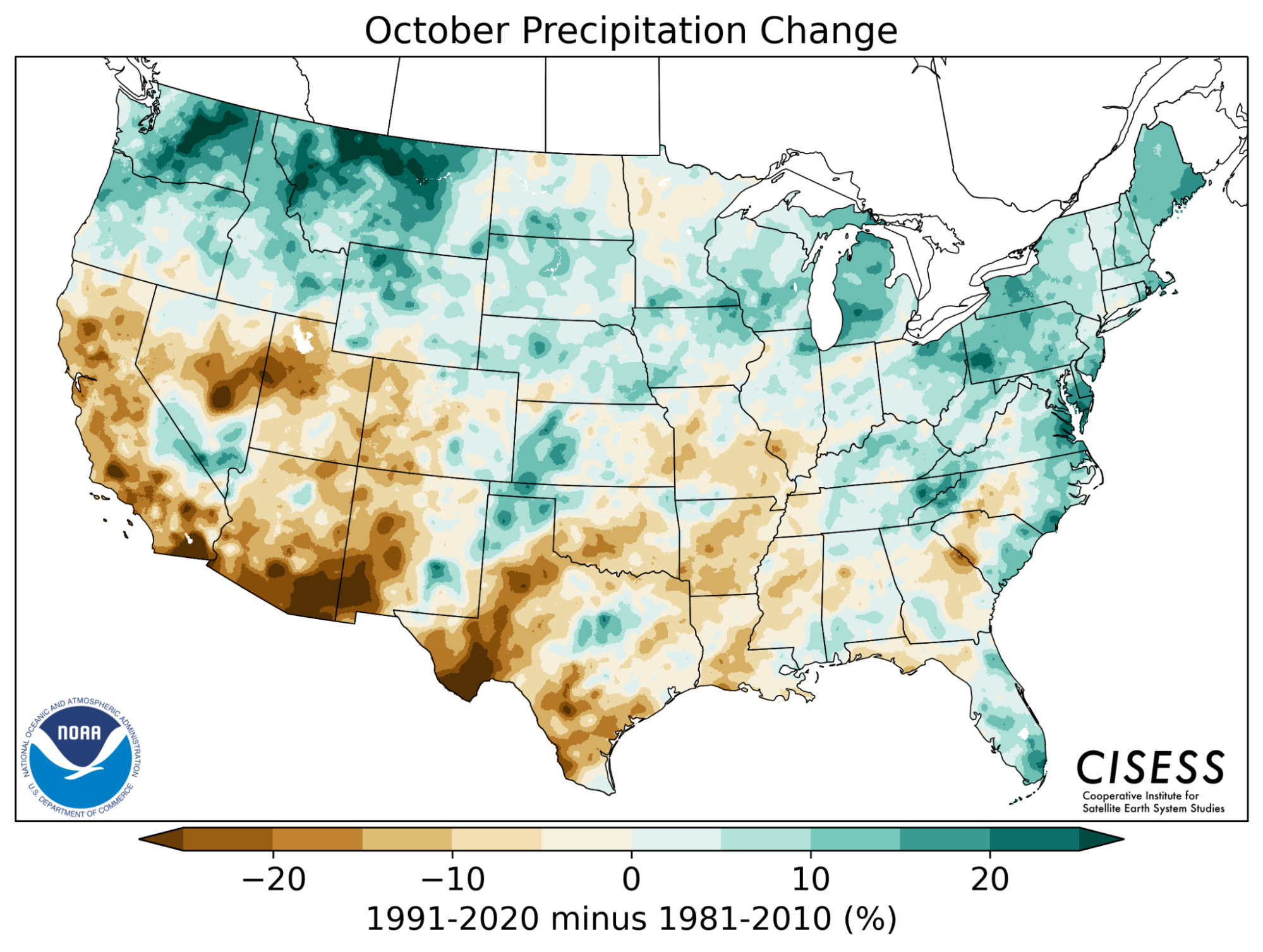
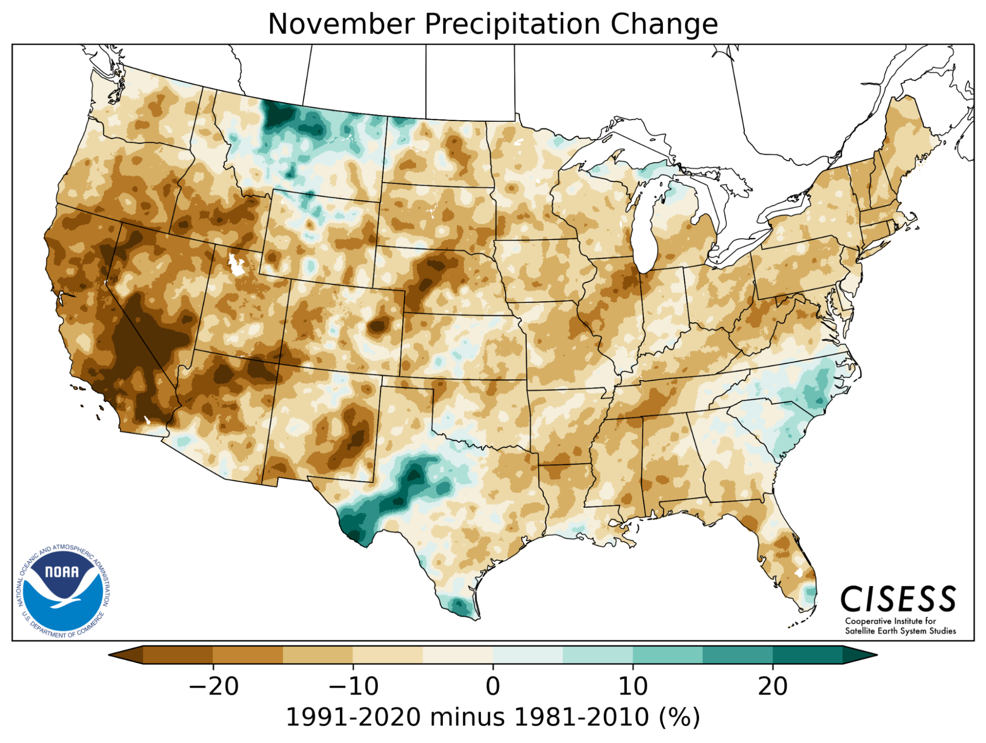
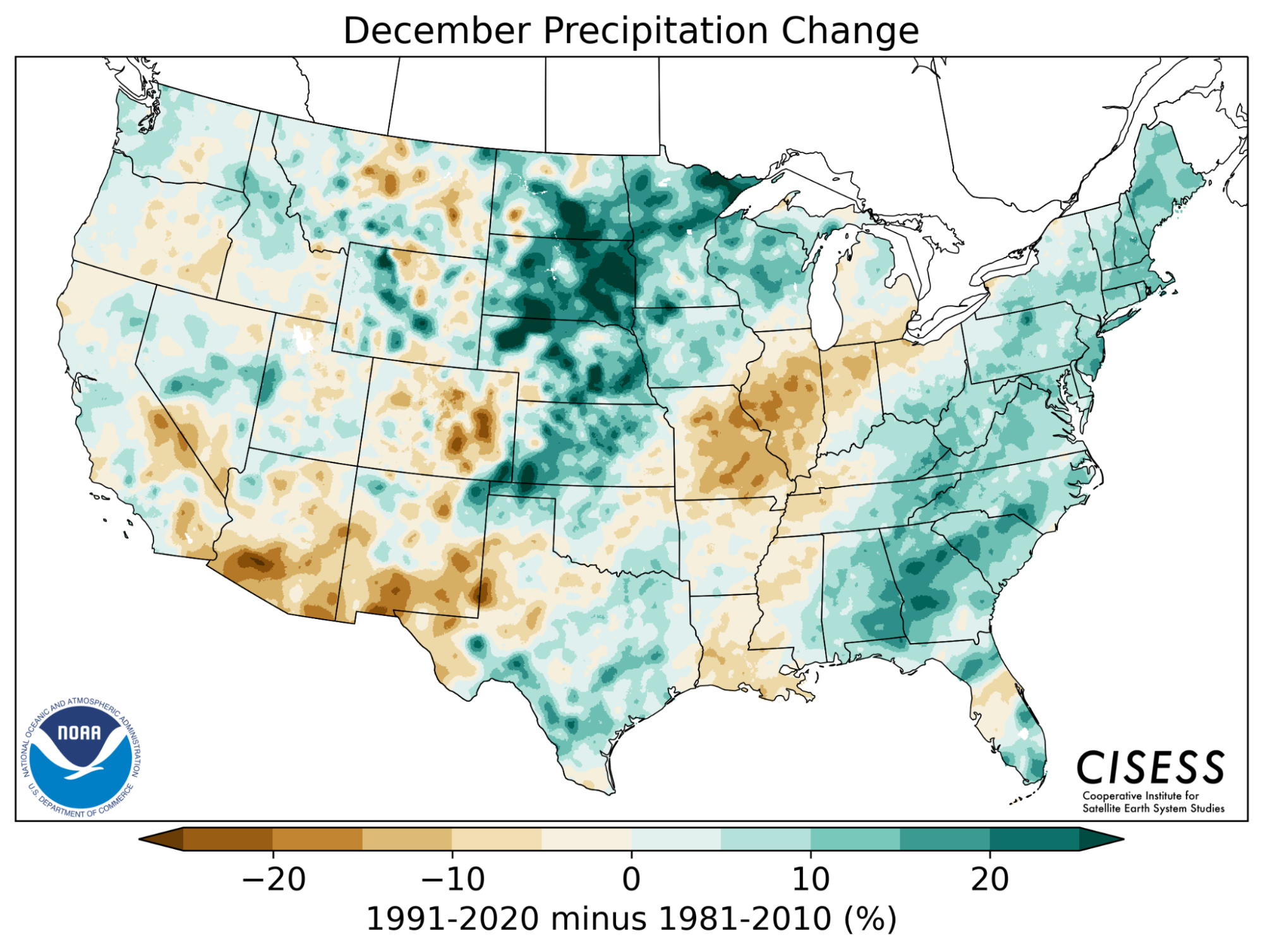
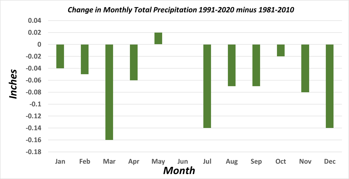
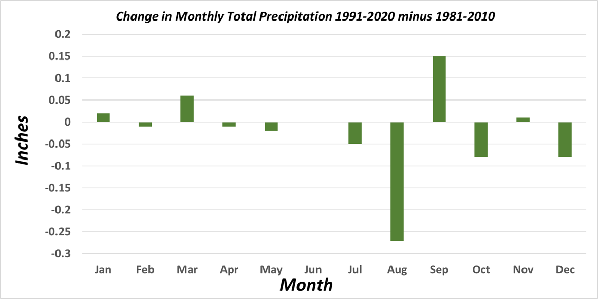
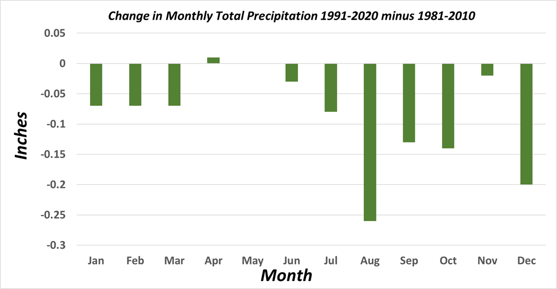
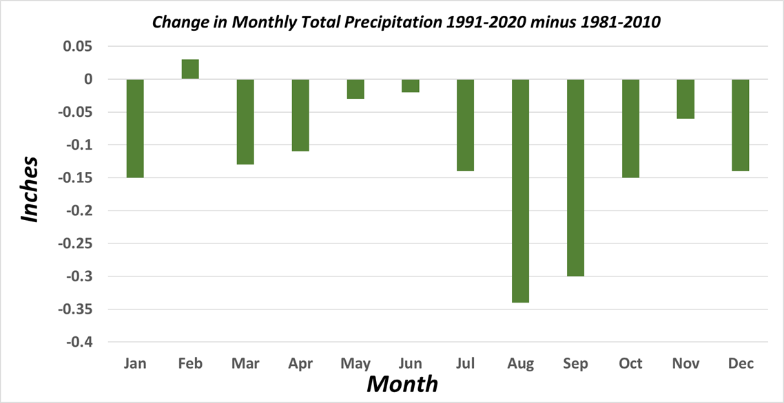
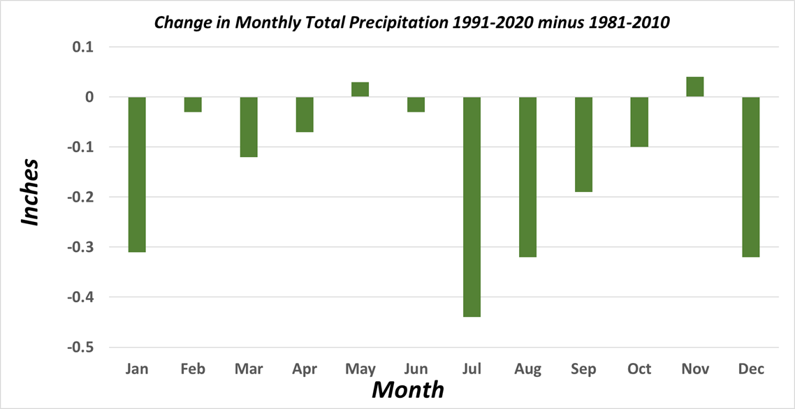
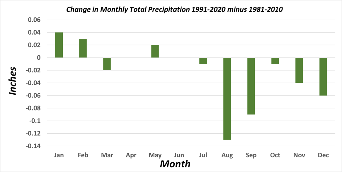
Changes in precipitation normals are far more variable with just about every location in the country experiencing some months with wetter normals and some months with drier normals. The case is no different in the Southwest, albeit with more months on the drier side and a larger percentage of change. In general across the Southwest, the largest percentage reduction in precipitation has occurred during the transition months (i.e. spring and autumn) which agrees with some climate research suggesting changes in the regional temporal distribution of precipitation.
|
|
|
|
|
|
|
|
|
|
|
|
|
|
|
|
Monthly changes in Total Precipitation from 1981-2010 to 1991-2020. (Click for full-resolution.)
|
Difference in precipitation normals (inches) across the Southwest during the monsoon months of June-September from 1981-2010 to 1991-2020. |
Comparison of 1991-2020 to 1981-2020 precipitation normals (percent) across the Southwest during the monsoon months of June-September. |
|
PHX |
|
|
|
|
|
NYL |
|
|
|
|
|
IPL |
|
|
|
|
|
SDL |
|
|
|
|
|
DVT |
|
|
|
|
|
BLH |
|
|
|
|
|
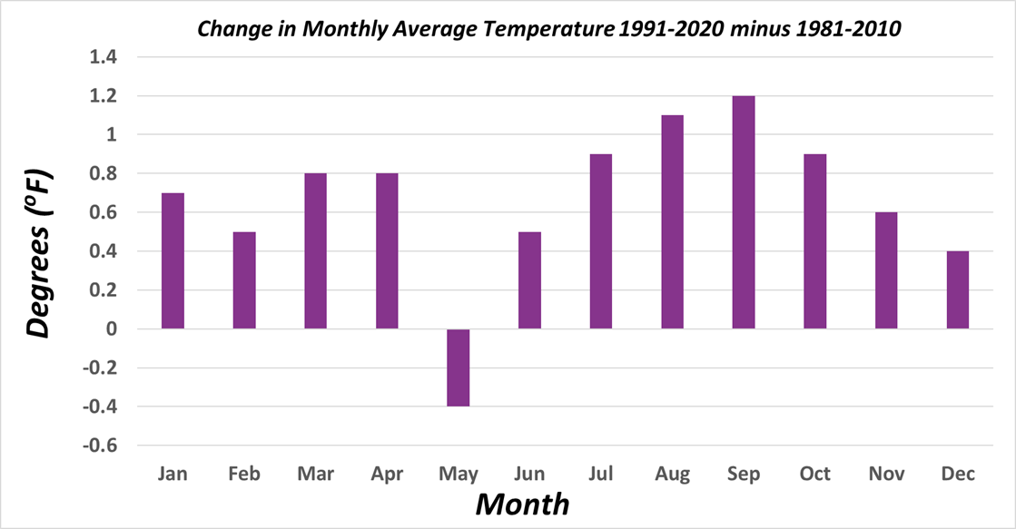
Month-by-month by changes of temperature and precipitation between 1981-2010 and 1991-2020 normals for various locations within the NWS Phoenix forecast area. Stations are PHX (Phoenix/Sky Harbor Airport, AZ), NYL (Yuma, AZ), IPL (Imperial/El Centro, CA), SDL (Scottsdale, AZ), DVT (Phoenix/Deer Valley Airport, AZ), BLH (Blythe, CA). |
||||
What are the reasons behind the observed changes/trends?
|
Change (in degrees Fahrenheit) of average annual temperature for the 1991-2020 period relative to the 20th century. |
Percent change in annual precipitation for 1991-2020 compared to 20th century baseline. |
The U.S. Climate Normals collection has 10 versions: 1901-1930, 1911-1940, and so on through 1991-2020. In the image below, we’ve compared the U.S. annual average temperature during each Normals period to the 20th-century average (1901-2000). Places where the annual temperature during a given Normals era was colder than the 20th-century average are blue; places where the temperature was warmer than average are red.
Annual U.S. temperature compared to the 20th-century average for each U.S. Climate Normals period from 1901-1930 (upper left) to 1991-2020 (lower right). Places where the normal annual temperature was 1.25 degrees or more colder than the 20th-century average are darkest blue; places where normal annual temperature was 1.25 degrees or more warmer than the 20th-century average are darkest red. Maps by NOAA Climate.gov, based on analysis by Jared Rennie, North Carolina Institute for Climate Studies/NCEI.
The influence of long-term global warming is obvious: the earliest map in the series has the most widespread and darkest blues, and the most recent map has the most widespread and darkest reds. Today, the normal annual temperatures across the country are warmer than the 20th-century average virtually everywhere. From 1901-1930, the annual average temperature was mostly colder than the 20th-century average.
What’s also obvious in these comparisons is that the influence of global warming on normal U.S. temperature isn’t the same everywhere or during every 30-year period on record. Otherwise, the maps would have transitioned gradually from dark blue everywhere to dark red everywhere. In fact, a few locations do exhibit that pattern of gradual, steady warming from one Normals era to the next including southeastern Oregon and southern Florida. You can probably spot others.
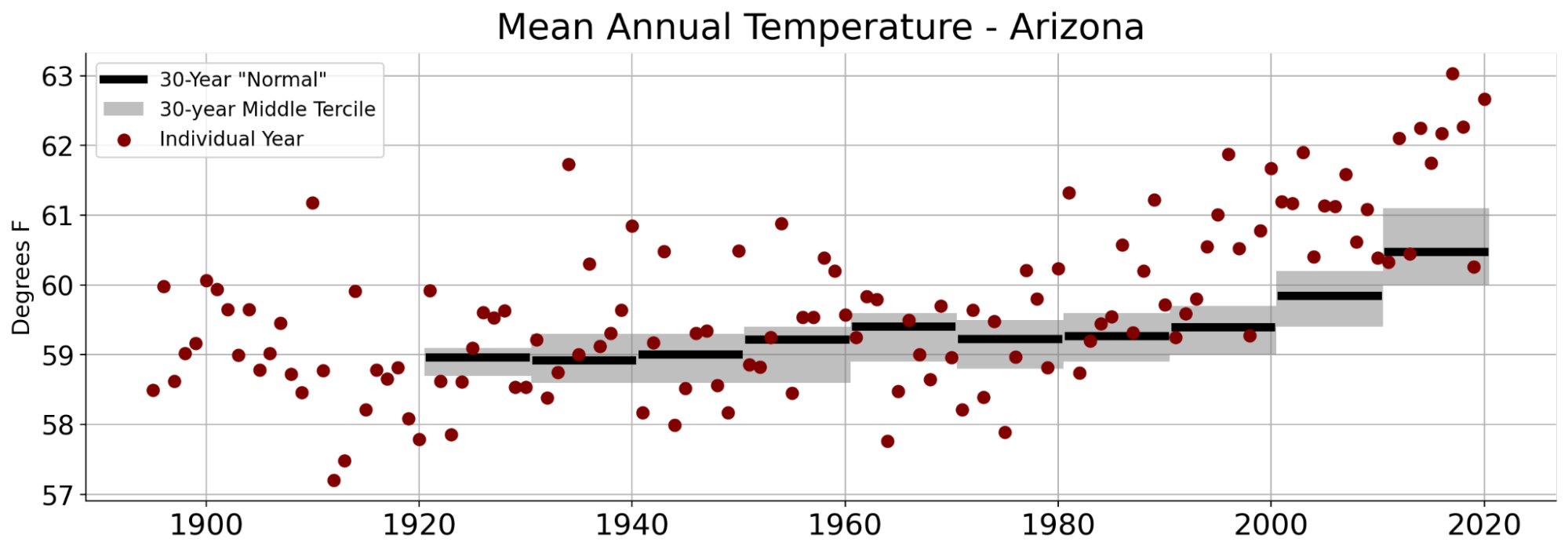
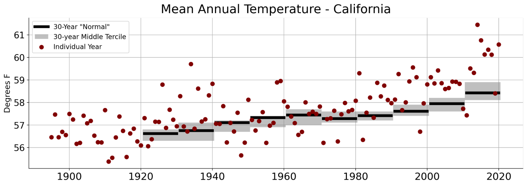
For the Southwest, the warming trend has been steady and persistent. Arizona has observed half a century of increasing annual temperatures, with the last year to fall below the middle-third of its comparative normals being 1982. Temperature trends are similar, but less extreme and with more year-to-year variability, across California.
Annual temperatures (red dots) compared to 30-year normal periods (black bar with range of middle tercile in gray) for Arizona (top) and California (bottom). Both states exhibit a warming trend for the past several decades with below normal temperatures (below the gray box) becoming rare.
“It varies” is the main message of the maps showing how the normal annual precipitation across the country has changed. Precipitation—regardless of human-caused climate change—varies a lot from place to place across the United States. Few places exhibit a precipitation trend that is either steadily wetter or steadily drier than the 20th-century average. Instead, drier areas and wetter areas shift back and forth without an obvious pattern.
.
Normal annual U.S. precipitation as a percent of the 20th-century average for each U.S. Climate Normals period from 1901-1930 (upper left) to 1991-2020 (lower right). Places where the normal annual precipitation was 12.5 percent or more below the 20th-century average are darkest brown; places where normal annual precipitation was 12.5 percent or more wetter than the 20th-century average are darkest green. Maps by NOAA Climate.gov, based on analysis by Jared Rennie, North Carolina Institute for Climate Studies/NCEI.
For example, the Southwest was much wetter than the 20th-century average in the 1901-30 and 1911-40 Normals, and then mostly drier than the 20th-century average in the next four Normals. The 1961-90 Normals were a mix, with few areas either very wet or dry relative to the 20th-century average. The next two Normals periods—1971-2000 and 1981-2010— were once again much wetter than the 20th-century average across much of the Southwest, but the pattern has reversed in the new Normals.
Despite the fact that human-caused climate change likely is influencing U.S. precipitation in some places and seasons, that inconsistency isn’t surprising. It’s just that what controls precipitation varies so much from place to place and month to month that the influence of global warming also varies a lot. Some parts of the country are projected to see increases in annual average precipitation, whereas others may see decreases. Some may see wetter winters but drier summers, with little net change in annual average precipitation—but big impacts on natural ecosystems and agriculture that depend on a certain seasonal cycle. Some will see a shift in the type or intensity of precipitation without seeing a change in their annual total. More rain, less snow. More downpours, with longer dry spells between.
With all this nuance, it’s not surprising that precipitation maps don’t show the same unmistakable fingerprint of climate change that the temperature maps do. And yet, it’s probably not a coincidence that the last four maps in the series—the 1961-1990, 1971-2000, 1981-2010, and 1991-2020 Normals—are nationally the four wettest-looking maps in the collection. At least some of that wetness relative to the 20th-century average is linked to the overall warming and “wetting” of the atmosphere that’s occurred as rising temperatures enhance evaporation of water from the ocean and land surface.